It’s been a while since I last checked in on Cap Metro ridership. CapMetro has released a snazzy performance dashboard, but it didn’t completely visualize the data how I wanted it to so I put together a dashboard of my own using CapMetro’s data to help me understand the dynamics affecting bus riders in Austin. I’ve found some continuation of existing stories and some stories that are completely new.
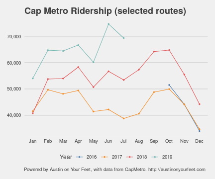
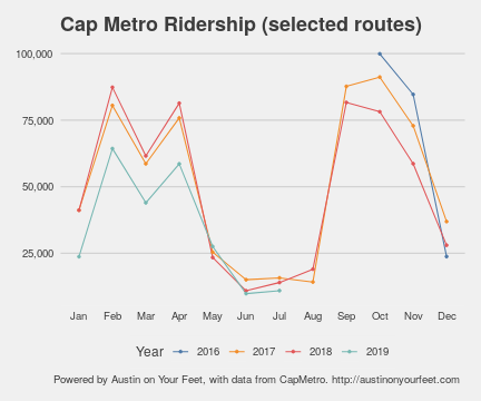
Overall Ridership Continues to Climb Since Cap Remap
Since June 2018, when CapMetro revealed it’s “CapRemap” redesign of bus service, ridership has been increasing*, and that increase has now built on itself, with June and July 2019 up considerably over June and July 2018, which themselves were up on 2017.
I’ve heard at least four theories why ridership might be up:
- The new map and frequencies serve customers better.
- There are more overall buses on the streets.
- There have been other service improvements in the same time frame, such as the new operations center which should help space buses out better.
- There are more transfers, which register as multiple boardings for a single trip.
The first three reasons would all represent real improvements in transit service, whatever combination they appear in.
Although these improvements are impressive, there are three factors that make them even more impressive:
- With a few exceptions like Seattle, transit agencies around the entire United States are losing ridership.
- Prior to Cap Remap, Cap Metro had been steadily losing ridership, so this represents a reversal in trend.
- UT shuttle ridership has been steadily declining for structural reasons for at least the last decade.
Indeed, if you exclude UT shuttle ridership, the gains look much more impressive. July 2019 saw 13.3% higher ridership than July 2017!
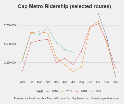
Weekend Ridership Up A Lot Since Cap Remap
Drilling down to just the weekend shows a lot higher ridership. This is a pretty straightforward function of running more routes on weekends starting in June 2018.
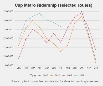
UT Shuttle Ridership Continues Decline
As discussed above, ridership on UT shuttles has been declining for more than a decade. That trend has continued.
Scooter effect in West Campus
One of the theories for why shuttle ridership has declined is that students have moved closer to campus (specifically to West Campus). However, if we look just at the four routes that stay pretty close to campus (640-Forty Acres, 641-East Campus, 642-West Campus, 682-Forty Acres/East Campus), we see a decline in 2019 after holding steady in 2018. Clearly, this isn’t because more people are moving to West Campus. One theory is that a number of these trips (typically under 1.5 miles) are being taken on scooters and bikes rather than buses.
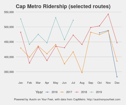
Mopac Express Lanes have boosted Express Routes
When the Evil Mopac project finally completed, it was mostly aimed at getting more people and their cars in from the suburbs to the city faster. But one other effect it had was to open up express lanes for express buses. The results of faster trip times on ridership have been pretty dramatic. MetroExpress shuttles have 79% more ridership in July 2019 than July 2017!
More to come
The numbers above all seem like good signs, but they are much more impressive as increases than they are as raw numbers. Austin still has very low transit ridership compared to many other cities, compared to what we could have, and compared to what we need to have if we are to stop being some of the worst carbon dioxide emitters on the planet. Austin is very much not yet a “transit city.” We will need sustained ridership gains of this size for a long time if we are to achieve our mobility and climate goals. In order to make that happen, CapMetro is going to need Austin’s City Council to walk the walk (bus the bus?) as much as it talks the talk: right-of-way all over the city dedicated specifically to transit; safe, comfortable sidewalks everywhere so people can walk to the bus; and dense housing, especially in central Austin near transit lines.
As the data gets updated, I will continue to monitor these stories and more. The code for this visualization is open source, so if you have feature suggestions, feel free to make a feature request or implement it yourself. And if you have interesting stories you’ve found by playing with the dashboard, tag @atxonyourfeet on twitter, share them on our Facebook page, or email me (dan@austinonyourfeet.com).
*Throughout this post, I have used numbers that have been normalized so that all months appear to have the same number of weekdays, Saturdays, and Sundays, to avoid showing differences purely based on the number of weekdays in a month.