This blog cut its teeth analyzing Project Connect’s light rail vision in 2014 but I’ve stayed relatively silent on the current iteration of Project Connect. Largely, this was because Project Connect did pretty extensive but not super sexy analysis in their preliminary reports and I didn’t have much to object to in it or add to it. The one time I chimed in was to encourage new CapMetro CEO Randy Clarke to make the easy call that Austin is ready for trains and maybe give a caveat that if new technologies emerge during the process, we can change our mind.
In the six months since I wrote that piece, Hurricane Randy has blown the process in some completely unexpected directions. In a carefully orchestrated Austin Chamber of Commerce conference presentation that more closely resembled a Steve Jobs product reveal than a city hall briefing, Clarke doubled down on new technology, revealing a map with Austin’s highest ridership transit routes labeled “Autonomous Rapid Transit,” a constellation of technologies like machine vision and vehicle-to-vehicle communications that he sees as changing the cost / benefit relationship on steel rails (i.e. trains) vs concrete lanes (i.e. buses or new tech-augmented vehicles). Since this whirlwind presentation, Austin’s transit activism has been scattered in new configurations, with different camps forming largely based on how they feel about the relative merits of tried-and-true trains vs betting on newer, cheaper technology.
These are very important questions but the thing that really struck me was not the mode but the map itself. Earlier, Project Connect spent $3.5m conducting a corridor study. The study didn’t produce a map of transit lines but what we might call “transit segments,” straight-ish lines where we might consider putting transit. It assessed each segment for how many people would benefit from transit service there and therefore how much transit capacity should be planned for. The result of the study was voluminous documentation on each segment, summarized in this map:
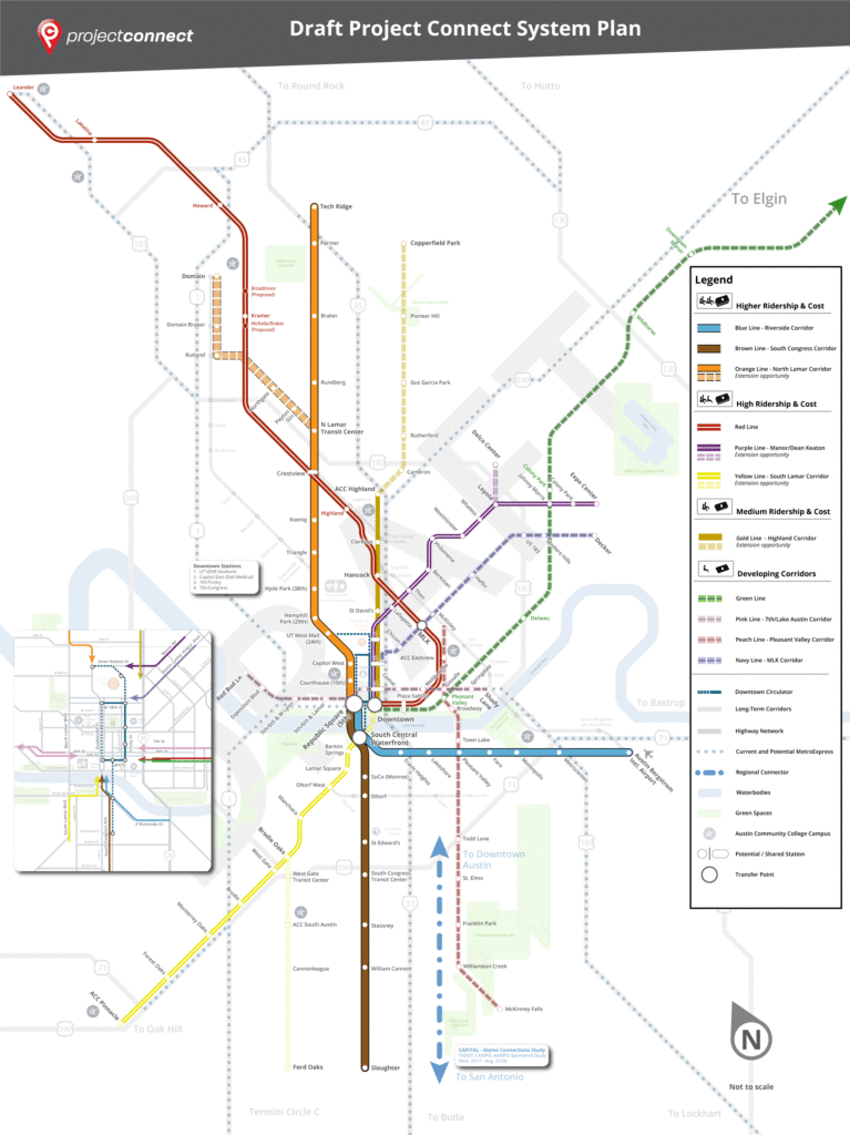
This is not a route map; how the segments fit together into transit lines isn’t specified yet. At the Chamber product rollout, CapMetro revealed their first cut at combining these segments into lines:
In this map, CapMetro has chosen two high-capacity lines: an Orange Line that connects the highest ridership orange and brown segments, and a Blue Line that connects the highest ridership blue segment with the medium ridership gold section.
A few questions jump out at me when I look at this map:
Why do the high-capacity Blue Line and the high-capacity Orange Line not connect?
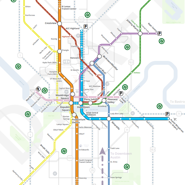
These two lines come tantalizingly close to one another! In downtown, they are separated by no more than a few blocks. At the Capitol, they literally have stations named Capitol East and Capitol West. Yet, if you want to transfer from one to the other, you’ll have to walk, even if it’s raining or blistering hot. There’s another way of configuring the lines that adds the possibility of a transfer, for little cost, just by switching up which segment south of the river connects with which segment north of the river:
The next question is: Why did the medium-ridership gold segment get slated for high-capacity service?
Everybody would love high-investment transit service everywhere. But we have limited funds to build and run the system. That’s why we spent $3.5m studying which segments are most useful to invest in. That study found that the gold segment was only a “medium” priority behind not only the three high-ridership segments but also two other segments. So why invest heavily in this gold segment? I don’t know. Maybe even though this segment isn’t a great idea from a ridership perspective, CapMetro think its necessary from a political perspective. If so, they’ve learned nothing from the 2014 referendum when voters rejected this exact segment.
Finally, there’s a related question: Why do we split ridership on our core transit spine into two parallel lines running pretty close to one another?
Austin has a pretty definite spine of population density from north to south. This makes running transit easy because a single line with excellent service can serve a lot of the population. People will walk 5, 10, or maybe 15 minutes to a local bus line, but our central spine is wider than that. So when we build a high-capacity, high-investment service, we hope that it’s going to draw people from a wider area than a local bus line. It’s going to be fast, frequent, unobstructed, and comfortable with expensive things like platforms for level-boarding and off-board payment systems to keep it going fast, as well as politically expensive things like dedicated lanes. As a result, some people will go further to ride. Maybe they’ll walk further, or maybe they’ll bike or scoot to the station, or maybe they’ll get dropped off, or maybe they’ll take a cross-town bus. Because the service is so much better, it’s worth it. A virtuous cycle gets started, where improved service encourages more people to use the service. This happens both from within the normal 10-minute walk zone because the service is more competitive compared to driving or taking a Lyft and from outside the normal 10-minute zone, because the service is more competitive versus taking the local bus.
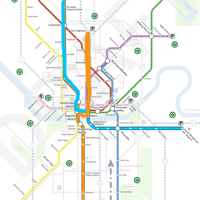
But the CapMetro plan to split those improvements over two segments running parallel to one another threatens to nip that positive feedback cycle in the bud. For the same costs, some of the vehicles that would be running on the central spine will instead be running on the parallel line. Neither line can run as frequently. In the companion piece to this blog, I’ve gone in more depth on an example. The extra construction costs of running more miles of track (whether steel or concrete) will also mean that we will have to save money somewhere else. What if, instead, we doubled down on a golden mile high-frequency transit spine? It could look something like this:
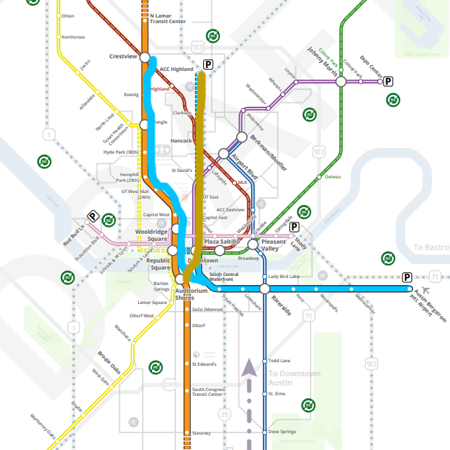
The Blue Line, instead of running parallel to the Orange Line, runs on the same track as the Orange Line up to Crestview. If the Blue Line is running 6 vehicles per hour and the Orange Line is running 6 vehicles per hour, then there will be 12 trains per hour between Crestview and Auditorium Shores — transit service of the likes Austin could only dream about right now. We would have six golden miles of transit-first city from Auditorium Shores to downtown to UT to the Triangle to the state office complex to Crestview. What was the northern segment of the Blue Line instead becomes the Gold Line, a medium-investment line as envisioned in the original Project Connect study. The money saved by not building parallel high-investment lines in the central city could be reallocated by extending the high-investment orange line from North Lamar Transit Center to Rundberg, improving the equity and usefulness of the route.
Is this the One True Austin Transit Map? I mean, I think it’s a pretty damn good one but I hope that our decision is backed by a little more research and analysis than this blog post. What I really hope happens is that the same project team that came up with such an excellent study of the segments is invited back to finish off the job and produce one or two final options for routes. CapMetro says that this isn’t the end, it’s the beginning and they’re open to changes. I hope that’s the case because this map needs more than a couple tweaks.