A few months ago, Austin revamped its bus system, making a sweep of changes to routes known as CapRemap. The new system made a number of bus routes run more often, at the expense of longer walks to some bus stops, more transfers required, and some infrequently used routes being rerouted altogether. How has it been going? CapMetro employees say that a thorough analysis will require at least six months of data but I decided to take a sneak peek because we’re impatient and because I want a chance to gain some context about what CapMetro is, does, and how it got to here.
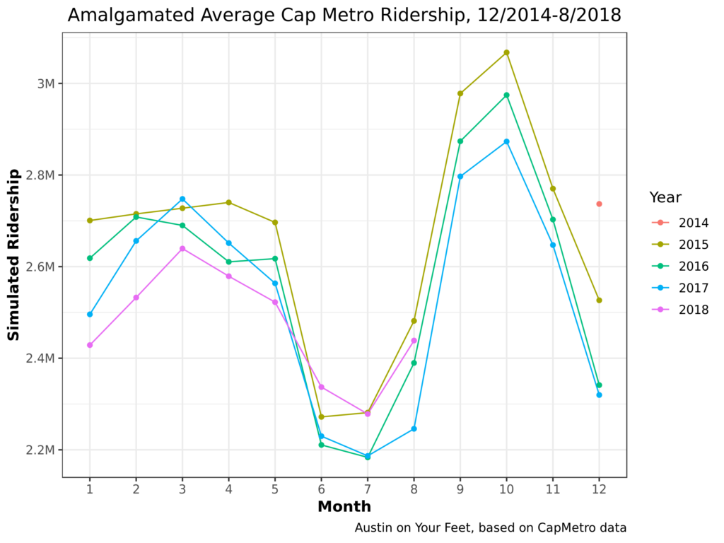
So let’s start! Early returns look positive. Very positive. Each line in this chart represents one year. 2014 only has one data point (December), so it doesn’t get a full line; just a single dot. And of course, I only have data through August for 2018.
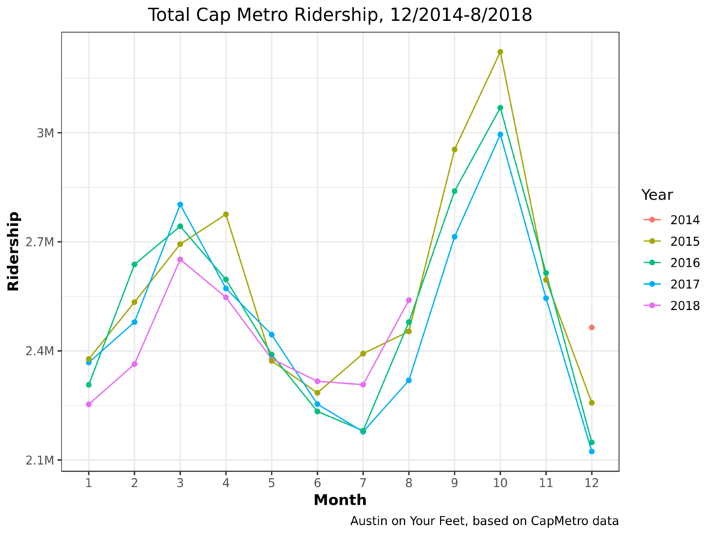
To assess CapRemap, look at the purple 2018 line. For the first five months of 2018 (pre-Remap), it hugged the bottom. CapMetro carried fewer riders in January 2018 than January 2017, 2016, or 2015. Same for Februrary, March, and April. Almost the same for May. Starting in June, when CapRemap went into effect, CapMetro mostly reversed the trend, carrying more riders in each month in 2018 than in the previous few years. There are good reasons to not celebrate yet. June, July, and August are low-ridership months for CapMetro, so CapRemap hasn’t been tested in the busy season.
So let’s look a little bit harder at some background information, so we know what to look for as we continue to evaluate CapRemap’s performance in upcoming months.
Some things that jump out to me:
1. CapMetro Ridership is highly seasonal! In addition to the summer lull discussed above, there’s a December lull (probably, again, because students and others take time off from work). There are also spikes in March and October, the two major festival seasons.
2. Until Cap Remap, ridership has been trending down each year. The highest ridership December was in 2014, with each successive December having lower ridership. 2015 was the highest ridership complete year, with 2016 and 2017 far behind. Before Cap Remap, 2018 was the lowest ridership of the lot. Cap Remap may have reversed this trend, but three months may not be enough to tell.
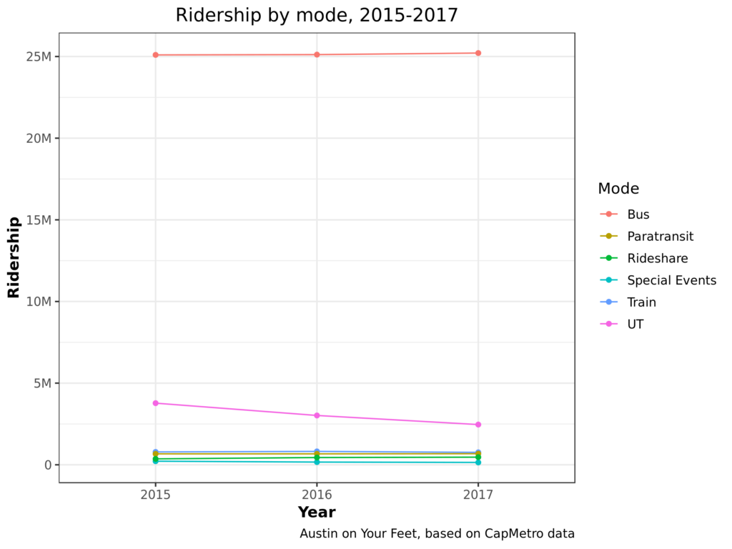
Let’s break these numbers down another way. Instead of breaking out years by month, let’s break them out by what type of service people rode: bus (local, express, or rapid), UT shuttle, train (MetroRail), Special Event, or paratransit (MetroAccess). This chart only shows the three years I have complete information on:
What do we learn?
- CapMetro ridership is overwhelmingly riding buses. The non-bus services like MetroRail and MetroAccess are vital services to the people who use them (MetroAccess especially), but to the extent CapMetro has a systemic effect, it’s overwhelmingly through providing buses.
- UT shuttle Ridership is dropping hard.
Let’s filter out the non-UT buses so we can see the rest of the categories better.
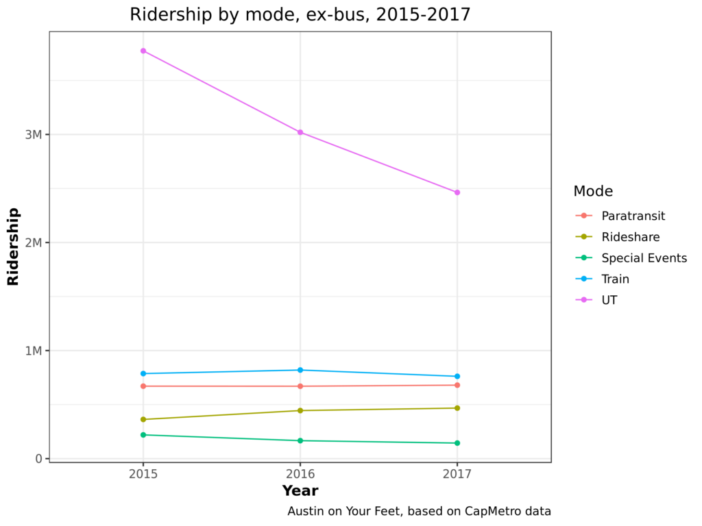
Again, the major plot point here is that UT shuttle ridership is plummeting. I’ve heard four theories why:
- Students are moving from bus-centric places like Riverside and Far West to walkable, bikeable, scooterable West Campus.
- Service cuts! Most routes have been either eliminated, combined, or had their frequency cut.
- More indirect service. As part of UT’s emphasis on making the core campus less of a place for motorized vehicles, UT shut down Speedway to cars and buses, making many of UT’s shuttle routes slower and less direct.
- UT shuttles used to be hop-on, hop-off. Today, they require UT students to swipe their ID and non-UT students to pay. This slows buses down and makes them less convenient.
How much do each of these hypotheses explain the ridership drop, if at all? That’s beyond the scope of this blog post. But just to confirm that this is an ongoing trend, here’s a picture of ridership of the UT shuttle on its own:
s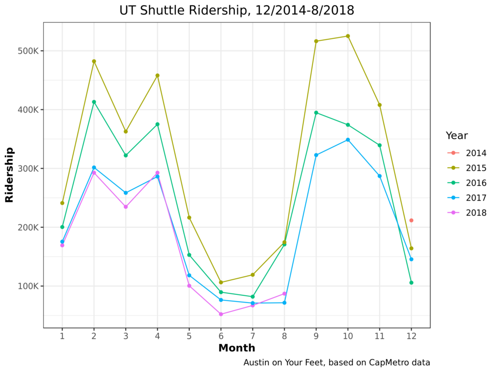
Yup, 2018 has continued that trend. Even the August number’s relative resurgence is probably more of a blip than a comeback, as August 2018 had more shuttle service days than 2017. Okay, we’ve looked at shuttle ridership enough. What happens if we look at total ridership again, but this time we look at all ridership except UT shuttles?
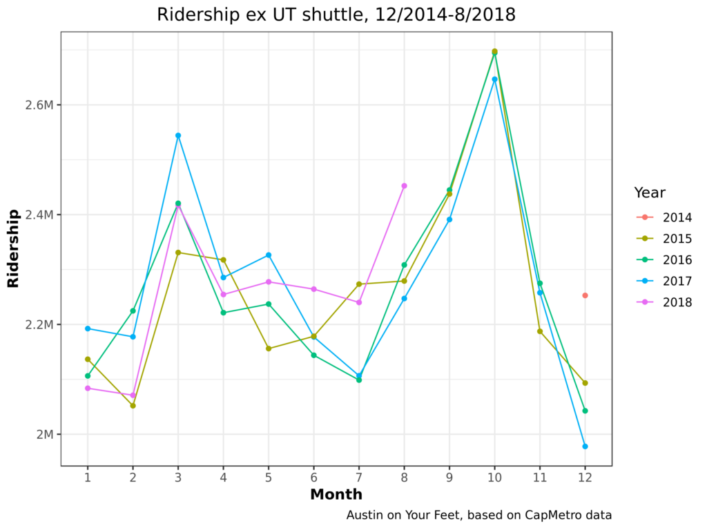
This changes things! 2017 goes from being the second-worst year to one of the best. Comparing this chart with the first, we can see the majority of CapMetro’s recent ridership losses have been from the UT shuttle. There’s a similar story to show regarding special event (mostly festival) service, which has also been declining in the last few years.
There are different ways of looking at this. On the one hand, we can say that CapMetro has actually been far more stable than some people (myself included) have given it credit for over the last few years. While nobody should feel satisfied with Austin’s levels of transit ridership, most classes of passengers aren’t leaving bus service even in drips and drabs.
On the other hand, UT students should be some of the easiest students to serve! They have less money to drive cars, they pay literally nothing for each bus ride they take (UT pays CapMetro a lump sum), they live in dense neighborhoods and travel to dense job / academic centers. CapMetro and UT have made some changes to this service over the last few years and ridership has dropped sharply! Did these changes cause the ridership drop? Were they worth it? If ridership is changing because more and more students live in West Campus, is it not time to look at improving service in West Campus? These questions haven’t got nearly the public hearing that they ought to have considering how dramatically UT shuttle service has declined.
I hope to make these charts a regular feature as new data is released. I will update some of the core charts above, enhance some of them with some more nuanced analytical techniques, as well as supplementing them with new charts to explain any interesting features we see in the data. Are there questions you’d like to see answered? What do you see in today’s charts? Let us know in the comments!
9/26 Update!
I have added some charts but it didn’t seem worth a new post.
[Editor’s note: these slides got lost in a server move. 🙁 ]
Something jumps out here! Sunday ridership is way, way up since CapRemap! This isn’t surprising as CapRemap increased Sunday frequencies. When the bus runs more often, people ride it more.
Finally, I’ve put together a bit of a more abstract chart. Two reasons why the other charts bounce up and down from month to month and year to year is that each month has a different number of days in it, and then even beyond that, each month has a different number of weekdays and weekends in it from year to year, depending on where it falls on the calendar. So I’ve created a notion of a composite month, which always contains 30 days, and which 1/7 of the days are always Sundays. This leads to a chart in which, instead of seeing ebbs and flows of which month has more weekdays in it from year-to-year, the ebbs and flows of ridership are based more strictly on how many people chose to ride the bus.
Nothing earthshaking here but that’s kind of the point. It’s smoothed out some of the jaggedness caused by February only having 28 days, or an August that has fewer weekdays than normal.