Increasing frequency through better management

Today is the first day that the 101, 1L, and 1M bus routes have been consolidated into the 1 and 801 routes. Let’s look at the new face of service along Austin’s central transit corridor: between downtown and UT.  There’s a lot of choices: routes 1,3,5,19, and 801 all have service between downtown and UT’s Westmall, for a total of 8 buses leaving from downtown for Westmall from 1PM until 2PM today (Sunday).  Not as good as peak UT shuttle service (15 buses per hour), but certainly not bad for Sunday service. Given how frequent they are and how variable on-time performance and walk-time from home to the stop can be, there shouldn’t be any point in looking up a schedule. 8 buses per hour is past the tipping point where it’s more effective to just show up and wait for the next bus than plan which bus you intend to take.

Varying Departure Points Hurts Frequency

If I were travelling from Westmall to downtown, that is exactly what I would do.  Unfortunately, my effective frequency northbound is much lower. Of those eight buses, two of them are route #3, which pick up on Brazos.  Three of them are route #801, which pick up on Lavaca.  One each are route #1 and #5, both of which pick up on Congress.  The last one is a #19, which picks up on Colorado or further north up Congress. No stop downtown has Westmall-bound buses coming more often than 3 per hour. From 8 per hour to 3 per hour changes transit-riding from being an easy, automatic, show-up-at-your-stop-and-don’t-worry mode of transportation to a riding-is-an-art mode where you have to keep an eye on the clock and the schedule, know which routes tend to run early or late, and have lots of knowledge of which routes run where and when.

There’s no good reason

During the years of road work on Brazos, routes 1L, 1M, 3, 5, and 101 all used to travel together up Congress, creating exactly the kind of easy transit corridor I’m discussing. Disappointingly, though, Capital Metro never spent the energy promoting the ease of use of this central transit corridor at the time as they did promoting the much-less-frequented Red Line. Indeed, during most of that time, Google Maps incorrectly reported the route 3 as still running up Brazos. Eventually, the 1, 5, and 19 will join the 801 on Lavaca and the 3 will be replaced by the 803 also on Lavaca, but they easily could have moved the 1, 5, and/or 19 over sooner.  Instead they chose to move other routes (the 7 and 20) from Congress to Lavaca first.

It’s About A System

As I said, this problem will be fixed.  What I fear for the future, though, is that this reflects on a pattern of transportation planners here in Austin doing a poor job of organizing the system as a whole. In discussing the introduction of the 801 route, CapMetro CEO Linda Watson and CapMetro staff go so far in removing the 801 from the context of the bus system they start to sound simply detached from reality–CapMetro staff can’t bring themselves to call the buses “buses” and CEO Linda Watson seems to share the delusion. (For the record, I don’t dislike buses; I just like reality.) Is it any wonder that when the organization’s leadership sees the 801 as not-a-bus operating outside the bus system, the new schedule fails to coordinate it effectively with its dowtown-to-Westmall bus siblings?

Organization Before Electronics Before Concrete

Why do I care so much about this oversight, that will eventually be fixed?  Transportation blogger Alon Levy introduced me to the German idea of “Organization, before electronics, before Concrete.”  In the context of his post, he’s discussing how transportation planners in New York and Philadelphia have found it easier to spend lots of money on new tunnels than deal with the difficult political issues in coordinating different agencies.  We have had our own version of that in Austin, where transit planners argued against even discussing coordinating better with our funding partners in the federal government to better serve the central transit corridor. But if voters don’t have confidence that you are doing the most to organize with the money you have, why would they vote to give you more?

CodeNext and “community character” in a changing world

Austin is revamping its land development code (i.e. “zoning”) in a project known as CodeNext.  It would be difficult to overstate how important this process is.  As I have said, zoning really is the central problem in Austin, as in many other cities.  Circumstances change and when cities don’t adjust to the changing circumstances, you end up with policies that don’t match the problems that the city is facing.  In a city faced with too many people driving too far and too many people driving until they qualify because central city housing is so expensive, Austin’s tight restrictions on multifamily development in the central city are really a bad leftover from a previous century.

Community Character

CodeNext’s current round of public meetings is framed less on change, though, but more on maintaining continuity.  This is how they describe it in the email they sent:

CodeNEXT is an unprecedented opportunity for Austinites to shape the way we live now and for generations to come. To be effective in framing how land can be used throughout the city, a revised Land Development Code should consider the unique character found in different types of neighborhoods throughout Austin. That’s where you come in. [emphasis in original]

We’re inviting you to walk your own neighborhood and document the features that make it unique. What do homes in your community look like? Your streets? Businesses nearby? Anyone can do it and we’ll show you how!

Although the framing here hints at things other than maintaining physical infrastructure (types of businesses), the majority of this framing is built around the idea of the “character” of a neighborhood reflecting the physical infrastructure of buildings, and nothing more.  I believe this is a mistake.

People Change Even When Buildings Don’t

I believe the buildings-first perspective is a poor perspective from which to guide policy.  As Edward Glaeser wrote in his book Triumph of the City: “Cities aren’t strcutures; cities are people.”  In the places where central Austin’s physical infrastructure has stayed pretty much the same over the last few decades, the neighborhoods have changed in character greatly.  I have friends who bought starter homes in sketchy neighborhoods and now live in expensive homes in swanky neighborhoods, all without either moving or the buildings around them changing much. The difference is that more people want to live in that neighborhood now, driving prices up.

Supply, Demand, and Price

In any market, including the housing market, supply and demand together determine the price.  In the housing market, the supply are the homes, the demand is the number of people who want to live in those homes (and the amount those people are willing to pay).   As time goes by, more and more people want to live in Austin, through many processes: natural growth as people have children, those kids grow up and move out to places on their own; a lot of urbanization as people move from the rest of Texas to live in Austin, and some cross-country migration as people generally move from the Northeast to sunnier places in the South and Southwest.  That is to say, the demand for living in Austin has gone up dramatically, and is currently trending upward.

So, the question for “community character” is: which determines a community’s character more: the price of living there, or the present form of buildings.  Preserving the character of the supply of buildings in the face of new demand means allowing all the change to come in the form of swings in price, as has happened in many places in Austin. Preserving the character of housing prices (e.g. “a good place for starter homes”, “an affordable neighborhood”) in the face of rising demand means changing the supply dramatically.

When it comes my turn to participate in the CodeNext hearings, I will express my preference for preservation through change: preserve (and restore) household affordability by changing the character of zoning constraints on supply.

Zoning: the Central Problem

Zoning is the central question for Austin, affecting virtually every issue we touch on. In previous posts, I’ve argued that the path to walkability is upzoning of central Austin neighborhoods near downtown and UT. I’ve also argued that upzoning is what’s needed to make Austin affordable. And the much-debated densities for the urban rail route are largely defined not by physical geography, but zoning geography.

Yet it’s a question I am only beginning to educate myself about. When Chris Bradford wrote his letter to City Council opposing the Highland route for urban rail, he was able to get much more specific than I have been:

In 2008, the City upzoned hundreds of tracts on Core Transit Corridors throughout the urban core for Vertical Mixed Use on the premise that these streets would be the focus of our transit investment and thus particularly suited for dense development… It is thus remarkable that Project Connect’s planners managed to choose the only sub-corridor — Highland — that lacks either a current or future Core Transit Corridor connection to downtown or UT.

 Getting to know Central Austin zoning

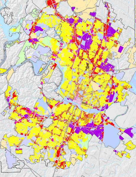
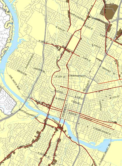
So I sought out some maps to give some visual clarity to Chris’ point and found them here. The first map shows current and future Core Transit Corridors and the lots zoned for Vertical Mixed Use (VMU) along them:

Map of Central Austin
Core and Future Transit Corridors in Red. VMU-zoned parcels in brown.

There is indeed VMU zoning along South Lamar, South Congress, North Lamar, Guadalupe, Burnet, Airport, and Riverside.  But, as Chris mentions, there is a big, transit-corridor-free, mixed-use-free gap north of UT, between Guadalupe and I-35, precisely where Project Connect is planning to run a train.  Based on this map, you might think that South Lamar is the best corridor for transit, followed by South Congress.  These are the streets with the most VMU zoning along them.  But VMU isn’t everything.  For a more complete look at what the zoning for these streets looks like, we turn to the general zoning map:

Large map of Austin Zoning
Yellow is SF, oranges and browns are mixed-use or Multi-Family. Lavender-ish is special downtown zoning, and purple is industrial.

This map is all of Austin. It’s hard to see specifics, but I include it to make the general point that Austin is largely zoned single-family (SF). In much public discussion, people focus heavily on new condos or on commercial areas, but I believe this is largely because that’s the interesting part of Austin. In terms of land area, it’s tiny. Now here’s a much smaller portion of that map, showing a small, central area of Austin:

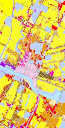
Map of Central Austin zoning
Lavender-ish area is downtown zoning, yellow is SF, orange and brown are multi-family or VMU, light blue is public land / UT.

A few things jump out:

  • Despite talk of central Austin becoming unrecognizably dense, a majority of central Austin by area is reserved for people to live in not-dense single-family housing.
  • VMU areas around South Lamar and South Congress are largely confined to those streets themselves. Just one parcel away from major streets, you are no longer allowed to build multi-family housing, let alone tall or dense mixed-use buildings.
  • There are three areas in Austin with real penetration of multi-family housing into a neighborhood and not just a major street: Downtown, East Riverside, and West Campus.
  • The stretch of the proposed rail line in the Highland subcorridor from UT to Airport Blvd is zoned for low-density single family housing.

Single-Family Sea as Impediment

Zoning touches on most issues Austin faces. But with these maps in mind, I think we can get more specific: one of the major zoning problems Austin faces is the sea of low-density single-family housing surrounding Austin’s islands of high residential density.  Upzoning downtown- and UT-adjacent neighborhoods to allow more than SF homes could help solve many of our problems:

  1. Transit Ridership We are a decent-sized city and should have no problem siting a rail line through density, where it will be used.  Yet to hop from downtown to the business and political class’ preferred site of future density (Highland), it would have to go through a sea of low-density single-family housing.
  2. Housing Affordability There is ample land on which enough new housing could be built to satisfy the rich, the middle-class, and the poor.  Even if the new housing is expensive, it would lower overall rents in a game of musical chairs. But it wouldn’t have to be expensive; building affordable housing is much easier when every home isn’t required to provide expensive amenities like personal gardens or yards, and homes (apartments or condos) can share walls and foundation.
  3. Tax Affordability It’s also cheaper for the city: expensive amenities like sidewalks and utilities can be provided cheaper the more people who share them.
  4. Transportation Affordability Housing built in central Austin is close enough to job centers that household transportation expenses could be eased by requiring fewer cars to achieve the same or better mobility. And fewer cars means less overall traffic.

Building islands of density surrounded by seas of single-family housing loses many of the benefits of the density, while retaining its costs.  This is a point similar to that made by Jeff Wood in his endorsement of the Guadalupe-Lamar route, where he calls for the creation of a single large employment district that isn’t separated by  low-density areas. And it really would be easy to do anywhere in Central Austin. West Campus  isn’t denser for natural reasons (e.g. better soil, less hilly), but policy ones: the city passed UNO, allowing more housing to be built. Given the enormous demand for housing, any downtown-adjacent neighborhood that the city removed SF shackles from would see growth.

What I’m NOT Saying

1. I’m not saying all SF housing is terrible and should be gotten rid of.  As I have said before (and again), I respect others’ preferences for living not only in single-family housing, but single-family neighborhoods (that is, neighborhoods that exclude/outlaw multi-family housing). When my last roommate and I parted ways, I moved to a small downtown condo and adopted a cat; she adopted dogs and moved a few miles away from downtown to find a place she could afford a fenced-in yard.  I would no more tell her she’s wrong to want a garden and yard than I would expect her to tell me I’m wrong for wanting a cat.  And, as you can see from the larger map, Austin the city (let alone the suburbs) is not remotely in danger of seeing single-family housing go extinct. To a first approximation, all of the housing areas of Austin are single-family housing areas.

2. I am not saying we should remake all of Central Austin to resemble downtown, with its soaring skyscrapers. As fast as Austin is growing, we would still run out of people to put in them before we got even close to that point. Even the relatively dense neighborhoods of West Campus and East Riverside are largely without downtown’s skyscrapers, and opening up more land area to denser building would satiate demand without every building going 20 stories high.

3. I’m not saying the city should demolish single-family homes. People who live in single-family homes close to downtown can go right on living in them; they just will now have the option of building more on their land or selling it to somebody else who wants to (or selling to somebody who doesn’t want to). The one thing they lose is the right to forbid their neighbors from building.

Politics

We are moving to 10 single-member districts and one at-large mayor (10-1) soon, a system that Chris Bradford worries will lead to “ward privilege” (Councilmembers granting each other carte blanche to veto development within their own district). Mike Dahmus describes a system similar to this already happening within one of the city’s most influential citizen groups, the Austin Neighborhood Council (ANC), where outer-Austin neighborhood associations support central Austin neighborhood association’s decisions about central Austin neighborhoods in solidarity, even if the outer Austin neighborhoods might be better served by central Austin densifying.

But I’m less convinced than ever that there are hard-and-fast rules about local politics. At least 9 out of the 11 incoming city Councilmembers will be new, due to term limits. A tiny fraction of voters vote in local elections and an even tinier fraction understand the full range of issues. A dedicated organization focused on understanding and changing local politics in an urbanist direction could make a tremendous difference. As the leadership of AURA has found, there is a hunger within many communities for this type of politics. Developers make a poor counterweight to neighborhood politics and a true grassroots coalition that wants to see dense development in central Austin could change things enormously.

Full Text of Chris Riley’s amendments

The full text of Chris Riley’s amendments to the Project Connect resolution:

WHEREAS, the Project Connect team has identified several sub-corridors which are appropriate for high-capacity transit investment; NOW THEREFORE BE IT FURTHER RESOLVED:

The City Manager is directed to work with Project Connect to identify future funding needs and potential sources to prioritize and continue critical Central Corridor project definition and development activities in the remaining identified sub-corridors, including the Lamar, Mueller, and East Austin sub-corridors, and report back to Council by August 1, 2014.

BE IT FURTHER RESOLVED:

The City Manager is directed to work with Project Connect and CMTA to continue cultivating a relationship with our regional Federal Transit Administration officials to cooperatively prepare for any future high-capacity transit investments in the Lamar sub-corridor.

Retrospective

On Thursday night, City Council chose to endorse Project Connect doing a detailed study of an urban rail route running from somewhere along East Riverside to somewhere near Highland mall. At the same time, it declined to request a similar study of the East Riverside to North Lamar (via West Campus) alternative. As regular readers of this blog know, my analysis of the data led me to prefer the latter. But Thursday was the last opportunity for West Campus / Lamar’s inclusion in a November bond election. Going forward, I will be focusing on some of AURA’s remaining goals. Today, however, I’m going to look backward and do a little retrospective on things that stick out to me of the previous few months.

Emergence of a new (not “New”) urbanist community

The growing community of folks centered around AURA were often glossed as being “pro-transit” and the debate at Council as representing a “divide in the transit community.”  Pro-transit was a term AURA often used ourselves.  (I say “ourselves” as I am an executive committee member of AURA.)  But I think “pro-transit” has caused a lot of confusion.

An Urbanist Perspective

A better term for this community’s common perspective is urbanist. Not just any urbanism, either, but an urbanism influenced by ideas of market urbanism. This perspective takes on a long list of issues from liberalizing zoning to pricing parking to allowing short-term rentals to improving transit to allowing urban farms. Some of the same folks discussing urban rail were involved in issues like opposing rental registration, extended parking meter hours, or specific zoning cases like TacoPUD. The (market) urbanist perspective generally believes in light-touch city regulations. While urbanists believe there’s too much space around Austin dedicated to parking, the policy tool we reach for is not city regulations against parking, but removing city regulations that require building parking. While urbanists enjoy density, we don’t strive to prevent people from choosing to live in low-density suburban areas.  We object to zoning that requires central neighborhoods to remain at low densities, as well as regulations that subsidize suburban living over urban living.  Similarly, we tend to think that even in large parcels like the Mueller development, the city should have a lighter touch: lay out a connected street and utility grid and let the neighborhood develop organically instead of master planning a giant community down to minutiae of aesthetic decisions. This is a short, bad treatment of the variety of flavors of urbanism and I have perhaps done a disservice to the majority urbanist opinion on one or more of these issues. But The point I’m making here is that the thing that unites this community is not (merely) our shared love for riding transit, but our shared vision for the future of cities.

Urbanists on Transit

This urbanists’ community’s perspective on transit, while generally far more in favor of it than the average Austin resident, is much more complicated than simply “in favor.”  Urbanists tend to fall into Avon Levy’s technical camp, seeing poor-quality,  poorly-used, or poorly-managed transit as just as strong an obstacle to good transit as the general anti-transit political climate is.  To take my perceptions: I believe MetroRapid is a decent project that found federal money to make incremental improvements to all buses in Austin, even if its badly oversold and may have played a lamentable role in preventing what would’ve been a fantastic rail line on Lamar. On the other hand, I see MetroRail as an inefficient subsidy for suburban living, because Capital Metro spends so much more per suburban MetroRail passenger than it does per urban passenger, and additionally because the vast majority of the MetroRapid MetroRail operational budget is paid for by CapMetro, thus operating in a zero-sum, fixed-pie competition with funding for urban transit. This ties into the general urbanist idea that there’s nothing wrong with choosing to live in the suburbs, but it shouldn’t be so heavily subsidized. The point I’m making isn’t the particulars of the argument on particular lines; the point is that the urbanist community focuses as strongly on the quality of transit as it does on its existence.

Other pro-transit voices feel betrayed

At the Council meeting, I saw many pro-rail folks seem to feel betrayed by, as they saw it, the spectacle of supposedly “pro-transit” people announcing opposition to a transit line (the Highland proposal).  Many of the speakers in favor of the Highland proposal emphasized that they were disappointed in the route themselves, but they were team players who believed in transit, no matter where it goes.  A statement supporting rail no matter the route was relayed from the Austin chapter of the Congress for New Urbanism, and the sentiment is well-summarized in my friend Stephanie Myers’ column for the Austin Post.  The implication was that those who opposed the Highland route were not team players.  Outside Council chambers, the discussion was considerably more heated.  The word “selfish” was relayed to me as a description of those urbanists who oppose Highland, because we are demanding transit be on our terms alone.  A debate on Twitter emerged over whether, should the bond election fail in November, the primary blame for it should fall on AURA, for prolonging the debate over route choice.

Both sides need more communication on urbanists’ goals

But, to me at least, the criticism doesn’t sting very much. When somebody is playing a dangerous game of chicken, in which they pretend to oppose a route they actually support in order to force others to get behind the route they support even more, it’s possible to shame that person into backing down and agreeing to compromise on the first option.  But it’s much more difficult to shame somebody about signalling their true opposition to a plan they really do oppose.  That, I believe, is the case with the anti-Highland activists.  They (we) simply believe the Highland route is a negative for the city*, so we will oppose it. We don’t oppose the Highland route out of vindictiveness or disappointment, but simply because we believe its bad policy. No amount of telling people that they’re selfish or “hurting rail” will get people back on board for what they believe is bad policy.  Nobody is ashamed to be the reason a bad project failed.

I do feel bad, though, that AURA’s messaging seemed to have failed to get our position across, leading many people to feel misled.  When AURA said, for example, that it stood for a successful urban rail project, I always took that to mean that our goal was to see an urban rail project with high ridership at the center of a walkable, urban central Austin.  Although I still think that’s possible if we start on Riverside first, for many of those who spoke at Council, the possibility for a successful urban rail project died on Thursday.  Although it’s always dangerous to assume what others think, my impression is that others read AURA’s goal of having a “successful urban rail project” as meaning “passing a bond with money for rail.” Understandably, they feel misled when AURA supporters threaten to vote against a bond, as that would clearly violate what they believed we said we wanted.  I believe many would have been able to better anticipate AURA opposition to Highland if they had believed AURA to be a fiscal responsibility watchdog who would only support an urban rail project with anticipated subsidy / ride below $X.

AURA is not a “pro-Lamar group”

Similarly, I believe that many of the people in the Council chambers on Thursday believed AURA to be a “pro-Lamar” group in the same way that the speakers who lived in Mueller were “pro-Mueller” or that two of the other “anti” speakers (Scott Morris and Lyndon Henry) are.  While its true that many of AURA’s supporters came to the conclusion that Lamar would be a fantastic location for an urban rail route–some before and some after the release of public numbers–few of us live and work along that route.  Zero of AURA’s four executive committee members would take an East-Riverside-to-Lamar route as a commuter.  I am the only one who lives near the route, but I live downtown so I’m near all routes under consideration and I work to the west, not north.  I struggle to think of more than one non-student member who would be personally served by the route. We supported Lamar because of our belief in its success, rather than because that’s the neighborhood we represent. Despite the fact that inclusion of Lamar was one of AURA’s prime goals for this last Council meeting, we have other goals. I believe I actually heard more support for East Riverside from those signed up “against” the item than from those signed up for! AURA’s goals, stated plainly in the resolution linked above, include a lot of goals that have nothing to do with Lamar and instead focus on trying to make the route as successful (by our use of the term) as possible. I do hope that others who are working with us see those goals and work with us to accomplish them.

Urbanists need a new Organization

For urbanists, I think the real lesson to be learned here is that the time for building an urbanist advocacy organization in Austin is now, if not sooner. There may be far less confusion about the position of the Transit subgroup of #ATXUrbanists than there was about Austinites for Urban Rail Action.

What does “Data-Driven” mean?

The other big area of confusion in the last few days for me has been the issue of a “data-driven process”.  There is clearly a large gap between what I took this to mean and what many others involved in the process mean by the same words.  Neither AURA nor others fully defined what it means, but I’ll do my best to parse what I see the differences are.  My overall impression is that for AURA, data-driven was shorthand for “give enough data and analysis to let the public and decisionmakers make their own, informed conclusions.” For many others, I believe data-driven was shorthand for “make a decision in an unbiased way.

AURA, for example, from before the process even started, requested an iterative process from Project Connect, in which data and analysis were released at checkpoints in formats that the public could play with and draw their own conclusions.  This did not happen, at least not as I see it. An extensive dataset with West Campus and no-highway alternatives was in fact released in a format that allowed manipulation, but three weeks after Project Connect’s final recommendation was made and just one week before CCAG was to make its decision.  Even then, it took me hours to figure out how to bypass the copy locks on it and I never did manage to figure out how to copy their formulas, though they were not difficult to reverse-engineer and reproduce. Project Connect’s public website, in which they asked people to weight criteria indices themselves, did more to frustrate than inform. Rather than giving the public information about the data driving the decision and then letting them decide, Project Connect sought information from the public and then told them what outcome they should want.

I received some negative feedback for doing an independent analysis of the data. This is a criticism that makes perfect sense in the “data-driven = fair” mindset: the decision had already been made by the time I started my analysis.  As there was no evidence (in their mind) the decision was unfair, my decision to do independent analysis was evidence that I in fact was biased, and merely trying to come to my own pre-determined conclusion as sour grapes because my preferred route wasn’t chosen. In the “data-driven = let the public decide” mindset, this criticism is bizarre.  The whole point of having a data-driven process was to enable exactly this type of independent analysis. I was merely making good on the promise of being data-driven in the first place.

Similarly, I was surprised to hear many members of CCAG praise Project Connect heavily for the strength of their analysis immediately on receipt of the final recommendation. Not because I thought the analysis was poor, simply because I was still waiting for analysis to be presented. In the “data-driven = unbiased” mindset, the burden on the project team was to show that they really did take all routes seriously, and that their methodology wasn’t intentionally tilted toward a predetermined outcome. The sheer volume of numbers used showed that they really did apply their methodology to many different routes.

In the “data-driven = inform the public” mindset, though, the important thing is for the staff to prepare enough information that, even if they included no final score or recommendation, the decision-makers would be able to decide for themselves.  What route would be best for ridership?  What route would relieve the most congestion?  How much would they cost to build? These are factors that the project team did consider internally, but I do believe that my cursory 20-hour analysis of the data may have presented far more digestable information about how each route scores on the different metrics than Project Connect did in any report.  Project Connect did present alternative weighting scenarios. This fits with the idea of attempting to prove that their weightings were done in an unbiased way. However, I was less interested in divining a final score than in looking at each of the metrics to understand what the numbers meant for how the different subcorridors would differ on the ground.

Again, I think that this is an area AURA needs to be far clearer on. I’m not entirely clear what “data-driven” means in my own head beyond “I know it when I see it” and we have, for the most part, failed to articulate what the advantages of our flavor of the policy would be.

Going forward

I’m very excited for the future of this emerging urbanist community.  I have met many fantastic people both in, around, and completely outside the community through this process. The process has uncovered many of this community’s strengths: analytical skills (if I do say so myself), social media presence, and, most importantly, we struck a nerve with a large corps of folks who feel unserved by the current political process.  But it has also uncovered many of our weaknesses: we did a much better job of communicating to our supporters than to others in the process, let alone the general public. We lack a solid organization and all the perquisites that come with that. We lack much in the way of support in City Hall. Many of our supporters feel jaded or angry, something that I think comes from being both interested in city politics and feeling unrepresented. These are all things a new urbanist organization can improve on.

* I believe that I find myself more in favor of the Highland route than many of my fellow activists.  I share the opinion that it would simply be a terrible project as a first leg.  But I do believe that, for similar reasons as Levy discusses here, it could be cost-effective as an extension to a successful Riverside-UT line.

HighlandMueller

Tonight, I will be putting out the text that I will use to address the City Council to argue for the ideas in AURA’s resolution.  One argument I will not be making, but that has been made by people whom I agree with most of the time and who I consider my friends, is that Highland is the same as Mueller.

I don’t understand the argument completely, but here are my reasons for not using it:

  1. It isn’t true.  At the most basic, simplistic level, Highland is a route that goes one place; Mueller is a route that goes someplace nearby, but different.  They share part of the same route, but not the whole thing.  AURA has emphasized that we should use actual, true facts in this process.  This isn’t an actual, true fact.
  2. It’s not clear why it matters.  There’s been a similar argument regarding the Red Line that Lakeline == Cedar Park.  In that case, the argument is that most of the passengers who take the Red Line from Lakeline station come from Cedar Park.  This matters because Cedar Park is not in the Cap Metro service area, so they are not paying taxes.  But Mueller is a part of Austin.  It’s not a priori obvious why having a route go to Mueller is bad.  My analysis says that Mueller is a less advantageous first route than Lamar or Riverside.  But then again, my analysis says the same about Highland, so bringing up Mueller just seems to confuse the issue.
  3. It makes Mueller sound evil, without explaining why.  I know a lot of people in the urbanist community are disappointed that Mueller didn’t become more urban, but most people in Austin don’t have some gut-level hatred for Mueller.  It’s a nice, growing neighborhood.  If you are implying that Highland is a stalking horse for Mueller, you either need to explain why that’s a bad thing or you sound like you just have an irrational hatred for one neighborhood.  Certainly, you can’t expect any politician to share in your concern.

Perhaps I’m missing something obvious.  But if so, maybe the argument needs to be fleshed out a bit better.  From my perspective, the fact that 2 years ago staff’s analysis chose Mueller and today’s staff analysis picks Highland, tells me that either: a) it’s a really good thing the public doesn’t just take staff’s word for granted because different staffs might come up with different answers, or b) projections can change rapidly, even in the span of just 2 years.

The Austin Precedent: Bus improvements block rail

The discussion on where Austin’s first urban rail route should run has switched tracks.  The Friday meeting of the mayor’s advisory group did not open with a discussion of the questions which have occupied this blog lately: which area of central Austin would best support an urban rail route (or vice-versa).  Instead, many advisory group members addressed emails from the public supporting studying a Lamar route by discussing what has been an elephant on the tracks: FTA funding for bus improvements.

Starting in January, Austin’s #1 bus route will see various improvements paid for by the FTA: longer buses, real-time information on bus location, wifi, longer spacing between stops.  Another bus route will see many of the same improvements a few months later.   As a frequent bus rider, I’m happy to see buses improve!  It’s a modest improvement–the buses will still get stuck in traffic through much of their routes.  But its benefits will not be limited to the #1 and #3 routes: the restricted-car lanes through downtown will eventually be used by most routes.  The heaviest costs of the real-time bus information system is setting up the system itself;  once the grant has paid for the upfront IT costs, Cap Metro will be able to expand it relatively inexpensively to the rest of the fleet.   Even the most expensive part of the system–the buses themselves–will save Cap Metro the cost of replacing the existing buses.  FTA is not funding *additional* buses along the #1 route, merely the routine cost of replacing buses, although the buses it’s replacing them with are nicer and more expensive than the buses Cap Metro would otherwise have bought.  Viewed this way, the FTA grant is less a massive upgrade to a couple of bus routes and more a clever way for the federal government to help pay for incremental improvements in Austin’s bus system, to be first deployed on Austin’s most popular bus route, the #1.

But was it too clever?  The argument at the mayor’s advisory group made was that FTA’s funding for these improvements would need to be paid back and reapplied for on a different route before the FTA would agree to upgrade a portion of the #1 bus to rail.  Furthermore, the FTA would not look kindly on Austin for applying for a larger, better rail project in an area they have already received funding and probably refuse to fund the rail.  Friend-of-the-blog Niran Babalola offers an interesting comment (via e-mail):

This example will be used around the country to demonstrate that investments in better buses push off rail for decades. This is counter to both the city of Austin’s interests (where MetroRapid in other corridors will probably be a good idea, but won’t be supported) and the FTA’s interests (who want cities to make bus investments until the money for rail appears, but will face more reluctance with this example).

So is it FTA policy that using FTA grants to improve your bus service endangers your ability to get funding for rail?  I don’t know; the most definitive piece of evidence on this question at the meeting was a sidebar conversation at a conference.  Julio believes this couldn’t possibly be right.   I hope an enterprising reporter can get the FTA to answer the question for us.  It’s a question with importance beyond Austin.

(In case it sounds like this is a novel worry; it’s not.  The furthest back I could find comment on this issue was Mike Dahmus’ blog posts from 2004, when the system was first proposed.)

Some more visualizations of Criteria and indices

Another day, another few new charts! 🙂

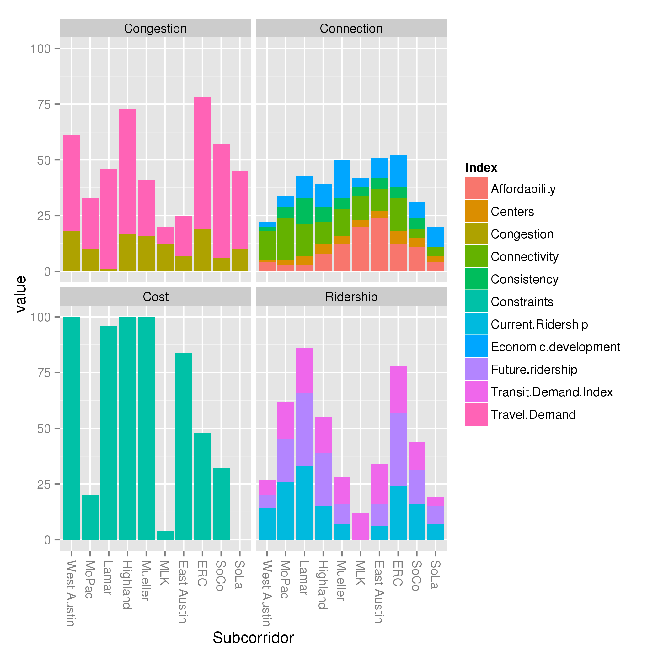
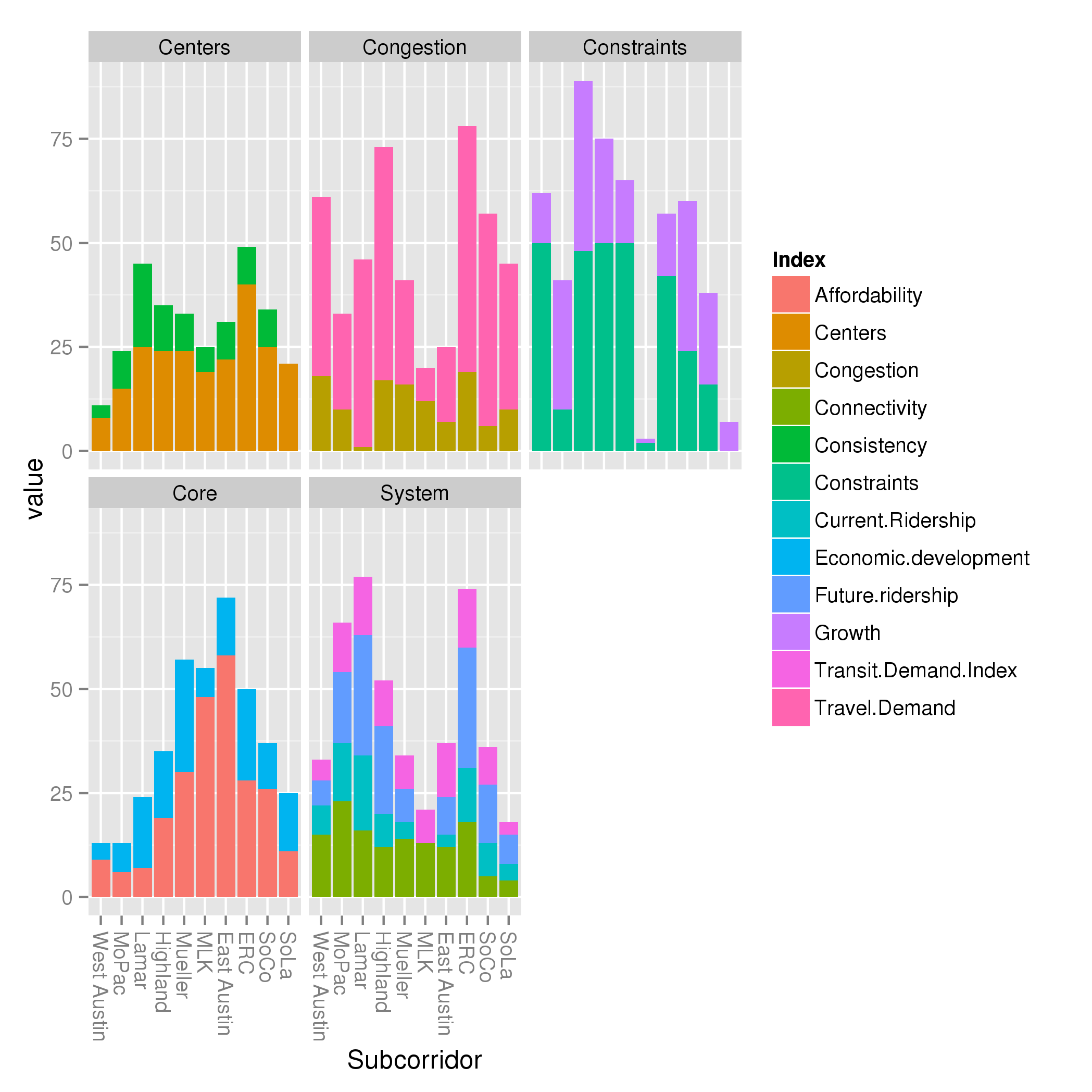
I have included 4 charts here.  When I presented the traditional, explanatory criteria, I created a visualization of how each subcorridor performed along each of these criteria.  But I began to wonder: which indices were driving the performance of each criteria?  So in these charts, I stack the contribution of the indices to the criteria:

Traditional criteria, normalized to min but not max

What can you learn from this?

  1. Weightings really matter.  Looking at the congestion chart, you can see the pink index ( Travel Demand Index) dominates the brownish one ( Congestion index ).  This is mostly because of the 5:2 weightings that Project Connect selected for those indices, and I maintained the same.
  2. If you track the orange “Affordability Index” at the base of the “Connections” criteria around the compass point, you can see it grow from a tiny amount in West Austin, peaking in East Austin, then start dropping again as it makes its way back around the compass.  This is a large driver of the “Connections” index, and is definitely making me question whether “Affordability” should be its own metric, separated from the rather junky “Centers” and “Consistency” metrics.
  3. The Ridership criteria is a more self-contained picture into one factor than the Connections criteria.  Although they both have multiple colors, picking a single color for the Ridership criteria will give you a similar picture as picking all 3: the 3 measures covary.  For the Connections criteria, this criteria may be useful for scoring, but not so much for gaining insight into characteristics of the subcorridors.

The next thing I began to wonder was about normalization.  As I discussed earlier today, Project Connect uses min-max normalization on all measures.  That is, it finds the minimum and maximum values any subcorridor score on a measure, then scale all the values from the minimum to the maximum.  I mentioned that I think 0 to maximum might be better, an idea I got from a coworker of mine.  The idea is that if you take, say, a measure like population density (measured in say, residents / acre), with 4 subcorridors scoring 65, 75, 95, 110 then normalize it along a min-max scale, you get the same values (0, .22, .67, 1) as if you have 4 subcorridors scoring 5, 15, 35, 50.   But in the first case, the subcorridors are within a factor of 2, while in the second case, the subcorridors are within a factor of 10!  Normalizing by max alone would result in scores of (.60, .68, .86, 1) versus scores of (0.1, 0.3, 0.7, 1).  A clear difference!

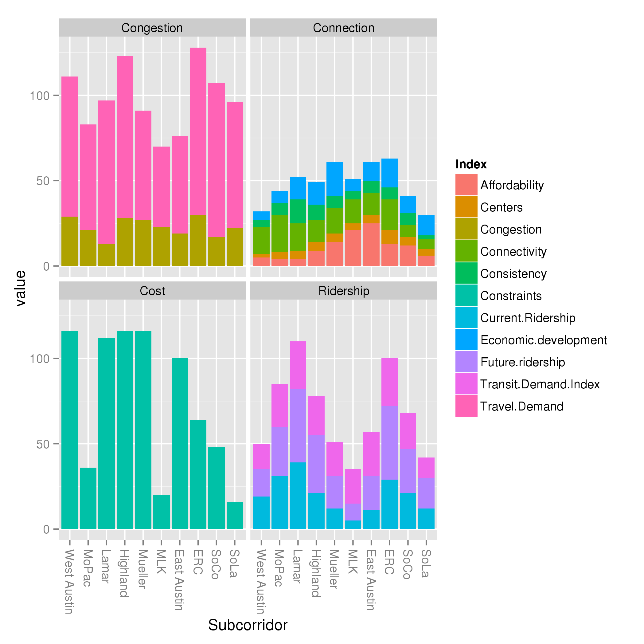
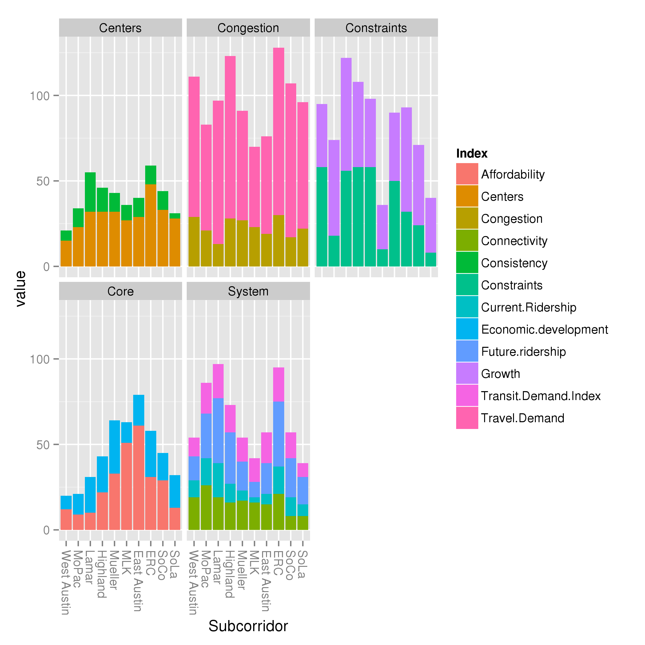
So I decided to rerun the whole analysis, normalizing by max rather than max and min.   That results in this chart:

Traditional criteria, normalized to max but not min

What did we learn?  A lot!  We can see that the congestion criterion, while showing dramatic differences above, shows very mild differences below.  Basically, all subcorridors are within a factor of 2 of one another.  Twice as much traffic is important, for sure.  But now look at the ridership criteria: the dramatic differences from one subcorridor to another maintained themselves.  While traffic might change as a factor of 2, ridership might change as a factor of 6!  Focusing solely on the blue “Current Ridership” index, we can see that MLK goes from non-existent (by definition, as the smallest subcorridor) in the far above chart, to a very small value in the near above chart.  It really is the case that Lamar and ERC score large multiples higher than MLK; that is not an artifact of min-max normalization like the large differences in congestion were.

Now, some caveats: some of this may be a result of the types of measures that went into each index.  I have not yet assessed that.

Also, some notes about these charts:

  • I have moved from showing the subcorridors in alphabetical order to using the order Project Connect prefers, around the compass from West Austin to MoPac to Lamar, etc.
  • I realize the colors are too similar.  Sorry.  Fixing that takes time and I wanted to get this out there tonight, before I go to bed.
  • In these charts, I have used the “Including West Campus in Lamar and MoPac” and “Eliminating negative weighting on present” data variants presented in this post.  I could rerun them for the other variants if there’s interest.

I also present Project Connect’s criteria, broken down by index (using min-max and max-only normalization):

Project Connect criteria, normalized to max and min
Project Connect criteria, normalized to max

What else do we learn from this?

  1. Constraints and growth is a ridiculous category for getting a handle on subcorridor performance.  These are two unrelated indices thrown together for no good reason.
  2. Similarly, the System criteria is mostly Ridership, but oddly diluted by throwing the unrelated Connectivity index in it.
  3. The “Core” metric is almost entirely affordability, along the familiar compass pointing East toward affordability.


Accurate charting and impact of West Campus

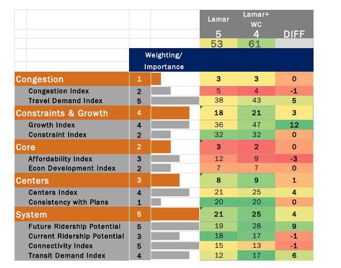
Project Connect has released a new FAQ.  In it, they show a comparison between Lamar with West Campus and without:

West Campus Comparison

Somehow, my numbers don’t add up the same as their numbers.  Any number of reasons could cause this discrepancy: I could have made an error in my hurry; their spreadsheet could not match the data they are using; I have found one such instance so far, but in that case, it was obvious.   A less obvious difference could easily have gone unnoticed.  They could’ve made an error, or they could be using a subtly different methodology than the one I believed to have reverse engineered.

However, the table they have produced above is at best sloppy.  At worst, it shows a lack of understanding of their own methodology and its implications.  Every single measure that Project Connect has produced has been normalized: that is, all the scores are rebalanced from 0 to 1, with the lowest-scoring subcorridor ranked 0, the highest 1, and the rest in between.

The “Diff” column in the above chart is not always meaningful, because each number in the “before” column and the “after” column may be set on different scales.  For a trivial example, take the “Consistency with Plans” index.  Lamar’s score without West Campus was 6.   6 was the highest score of the 10 subcorridors, so normalized, it becomes 1, and scaled up it becomes 20.  After adding in West Campus, Lamar’s score is 8.  This is of course still the highest of the 10 subcorridors, so normalized it also becomes 1, and scaled up it is still 20.  Lamar adds 0 to its score, as shown above.

However, scores only have meaning relative to one another.   East Riverside has a pre-normalized score of 4, a normalized score of 0.60, and a scaled-up score of 12.  After inclusion of West Campus in Lamar, it’s new normalized score is 0.43 or, scaled up, 9.  So, although Lamar’s “score” didn’t go up as a raw number, it did  improve by +3 relative to East Riverside.   Consistency with Plans is an unimportant, lowly-weighted index.  However, Future Ridership Potential is neither.  When including West Campus, Lamar scores highest on this metric as well.  That means that the “+9” difference is actually higher than +9, relative to the other subcorridors.

Unfortunately, these issues pervade the analysis.  Sloppy use of language in communications and sloppy charts such as the above don’t necessarily mean that their metrics chose the wrong subcorridor; it could just mean that they don’t take the time to write accurate communications.  However, it’s hard not to lose confidence in the choices that they made when they make elementary mistakes in the way that they present it.  Did they think through the implications of choosing to normalize from min to max, rather than what seems like the more obvious choice of 0 to max?  I would like to give them the benefit of the doubt that they had a good reason, but when I see sloppy charts like the one above it definitely shakes my confidence.

Update

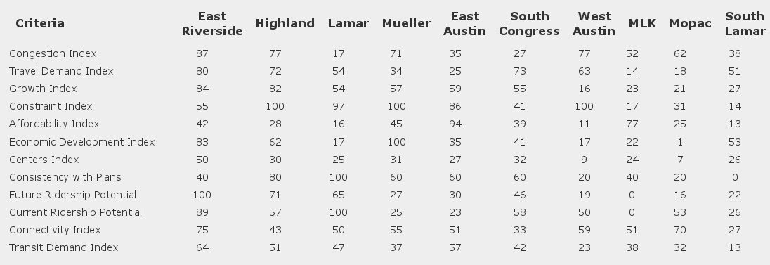
So I set out to figure out where I disagree with Project Connect.  And, the first thing I find is data inconsistency between Project Connect’s online tool and the spreadsheet they released, on the very measure I discussed above:

Raw Criteria from tool

Consistency Spreadsheet

Note the ERC’s score for consistency: 40 (0.4) on the online tool, and 0.6 in the spreadsheet.  This is the second such issue I’ve found; the first was an error in the spreadsheet.  Trying to reconcile difference between your calculations and theirs is nothing if not frustrating when there are data differences between two different versions of their own.  Identifying issues such as this are relatively easy in the Consistency criteria, as it consists of a single measure.  If there are errors in other measures, identifying them will be much more difficult.

Update 2

I misread the Project Connect FAQ.  My calculations are consistently very similar to theirs, and given the minor data issues like the ones above, I’m not surprised that they aren’t exactly equal.  Their wording on the effect of adding West Campus to Lamar is very squirrely: “Nevertheless, the overall impact improves the standing of the combined area by one position.”  From 3rd to 2nd.  From behind Highland to in front.   The same analysis as I found.  How they can repeatedly say adding West Campus doesn’t make a material difference and also say that it changes which the top two scoring corridors are is beyond me.

Update 3

Project Connect has updated their comparisons:

This is a step in the right direction, I think, though I’m still not completely sure what this means;  was this in a 11-way direct comparison?  Or was Lamar compared to Highland successively with and without Lamar?  (If so, there really need to be two columns for Highland: before and after.)   I did notice a disclaimer in a chart in Kyle’s presentation to CCAG that “numbers in columns cannot be compared to one another” which I appreciated.

But the basic message here is clear: inclusion or exclusion of West Campus makes a large impact on the final analysis.

A better visualization of effects of West Campus and time weighting

In my first glance, I showed that the Project Connect weightings resulted in different recommended subcorridors depending on whether you included West Campus in MoPac and Lamar, and whether you used negative weightings for present-day or used positive weightings for present-day, even if those weightings are smaller than those you use for the future.

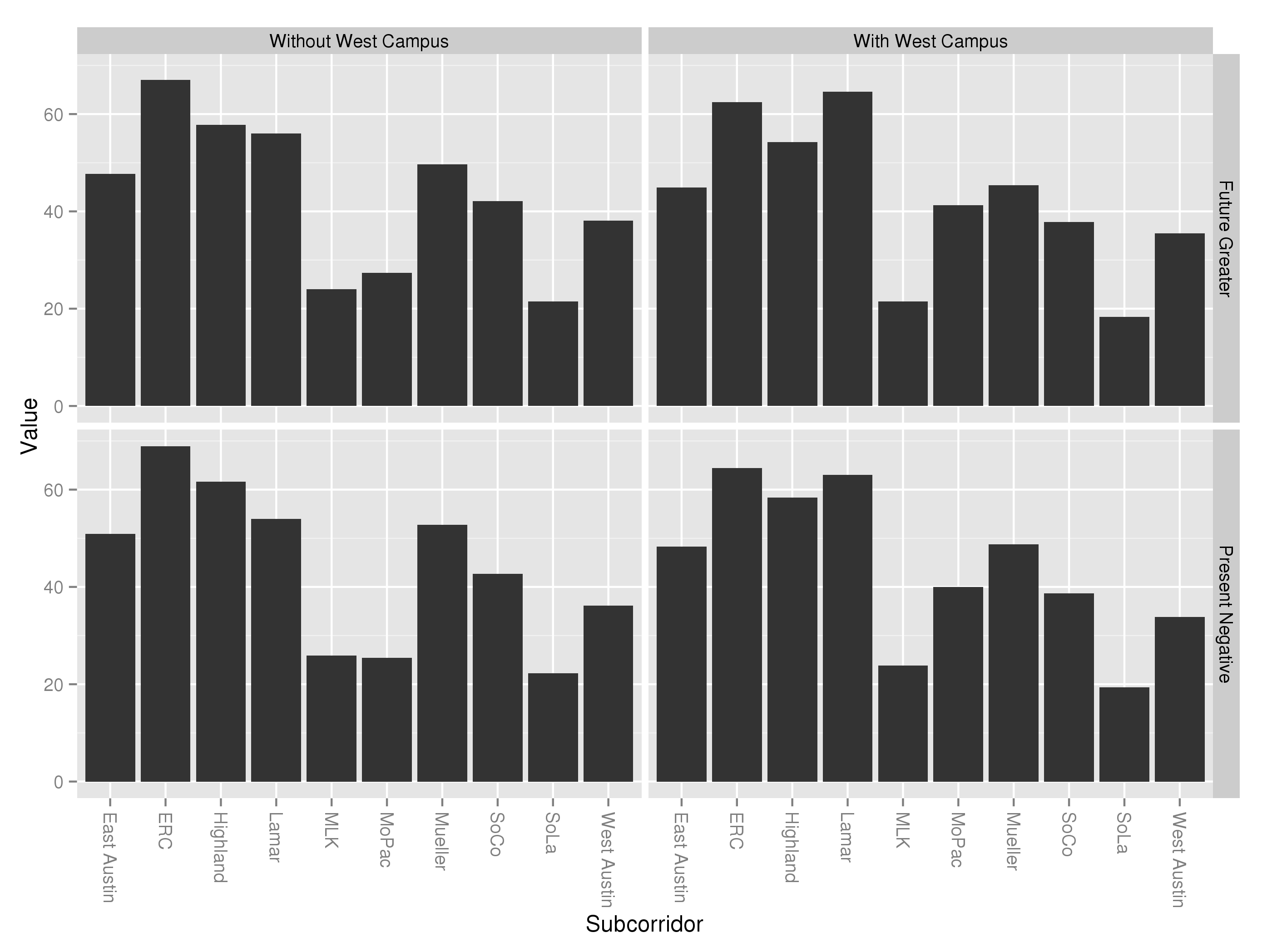
I have now put together a superior illustration for this effect here:Faceted Final Scores

As you can see, the choice to negatively weight present-day scores had a dramatic effect on the data excluding West Campus, pushing Highland and Lamar from a virtual tie (upper left) to Highland higher-rated (bottom left).  This is not surprising, as Project Connect’s methodology shows Highland as targeted for nearly 3.6% annual growth in population density.

When West Campus is factored into the mix, the effect continues.  However, this time the effect of the negative present-day weightings was smaller.  With a more balanced weighting (upper right), Lamar is the clear winner and Riverside second.  With the negative weightings, Lamar is second to Riverside’s first.  In both cases, Highland places third.

I still believe that Project Connect’s methodology for calculating the final score to be confusing and inferior to the more traditional weightings I employed here; one of the reasons for this is that their complications makes effects like these extraordinarily hard to understand at an intuitive level.  However, it is noteworthy that their data and methodology draw the same conclusions that mine did (Lamar and Riverside the top two subcorridors) when you include West Campus, and that it ranks Highland and Lamar as equal even excluding West Campus, if you just correct for the negative weightings of present-day data.