Another day, another few new charts! 🙂
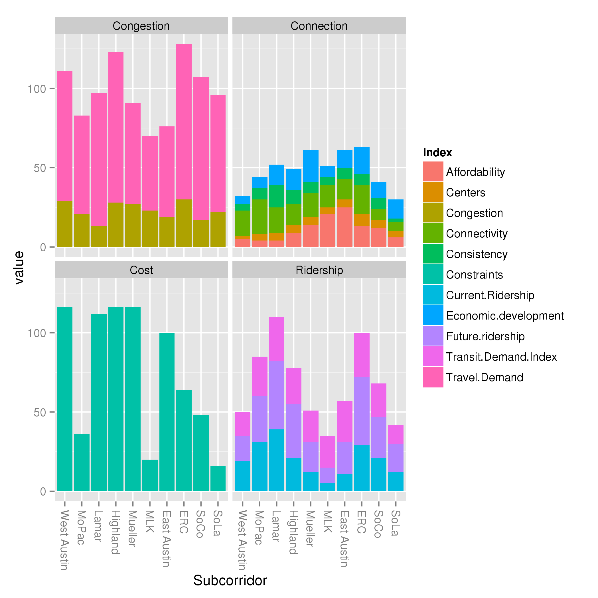
I have included 4 charts here. When I presented the traditional, explanatory criteria, I created a visualization of how each subcorridor performed along each of these criteria. But I began to wonder: which indices were driving the performance of each criteria? So in these charts, I stack the contribution of the indices to the criteria:
What can you learn from this?
- Weightings really matter. Looking at the congestion chart, you can see the pink index ( Travel Demand Index) dominates the brownish one ( Congestion index ). This is mostly because of the 5:2 weightings that Project Connect selected for those indices, and I maintained the same.
- If you track the orange “Affordability Index” at the base of the “Connections” criteria around the compass point, you can see it grow from a tiny amount in West Austin, peaking in East Austin, then start dropping again as it makes its way back around the compass. This is a large driver of the “Connections” index, and is definitely making me question whether “Affordability” should be its own metric, separated from the rather junky “Centers” and “Consistency” metrics.
- The Ridership criteria is a more self-contained picture into one factor than the Connections criteria. Although they both have multiple colors, picking a single color for the Ridership criteria will give you a similar picture as picking all 3: the 3 measures covary. For the Connections criteria, this criteria may be useful for scoring, but not so much for gaining insight into characteristics of the subcorridors.
The next thing I began to wonder was about normalization. As I discussed earlier today, Project Connect uses min-max normalization on all measures. That is, it finds the minimum and maximum values any subcorridor score on a measure, then scale all the values from the minimum to the maximum. I mentioned that I think 0 to maximum might be better, an idea I got from a coworker of mine. The idea is that if you take, say, a measure like population density (measured in say, residents / acre), with 4 subcorridors scoring 65, 75, 95, 110 then normalize it along a min-max scale, you get the same values (0, .22, .67, 1) as if you have 4 subcorridors scoring 5, 15, 35, 50. But in the first case, the subcorridors are within a factor of 2, while in the second case, the subcorridors are within a factor of 10! Normalizing by max alone would result in scores of (.60, .68, .86, 1) versus scores of (0.1, 0.3, 0.7, 1). A clear difference!
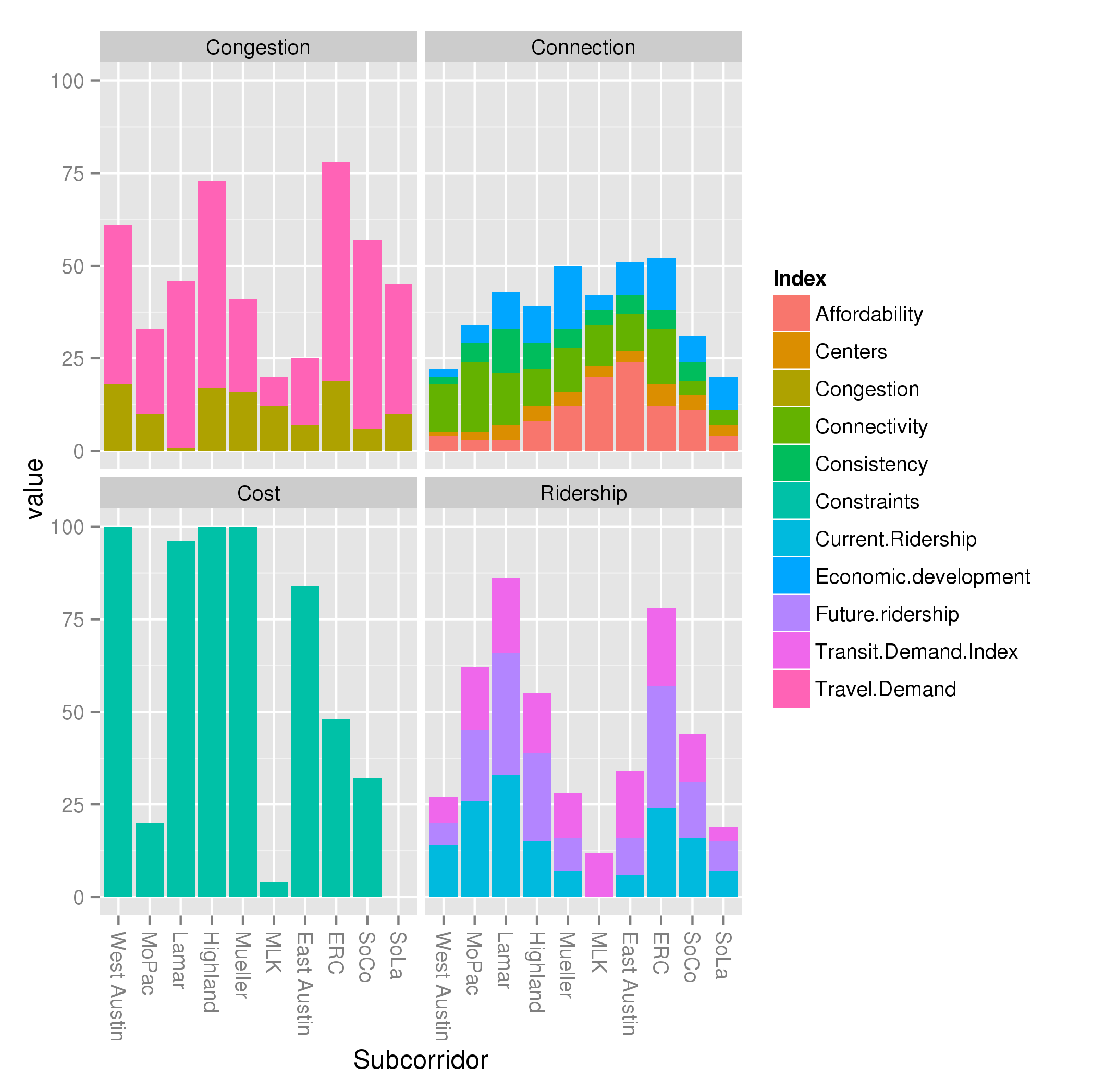
So I decided to rerun the whole analysis, normalizing by max rather than max and min. That results in this chart:

What did we learn? A lot! We can see that the congestion criterion, while showing dramatic differences above, shows very mild differences below. Basically, all subcorridors are within a factor of 2 of one another. Twice as much traffic is important, for sure. But now look at the ridership criteria: the dramatic differences from one subcorridor to another maintained themselves. While traffic might change as a factor of 2, ridership might change as a factor of 6! Focusing solely on the blue “Current Ridership” index, we can see that MLK goes from non-existent (by definition, as the smallest subcorridor) in the far above chart, to a very small value in the near above chart. It really is the case that Lamar and ERC score large multiples higher than MLK; that is not an artifact of min-max normalization like the large differences in congestion were.
Now, some caveats: some of this may be a result of the types of measures that went into each index. I have not yet assessed that.
Also, some notes about these charts:
- I have moved from showing the subcorridors in alphabetical order to using the order Project Connect prefers, around the compass from West Austin to MoPac to Lamar, etc.
- I realize the colors are too similar. Sorry. Fixing that takes time and I wanted to get this out there tonight, before I go to bed.
- In these charts, I have used the “Including West Campus in Lamar and MoPac” and “Eliminating negative weighting on present” data variants presented in this post. I could rerun them for the other variants if there’s interest.
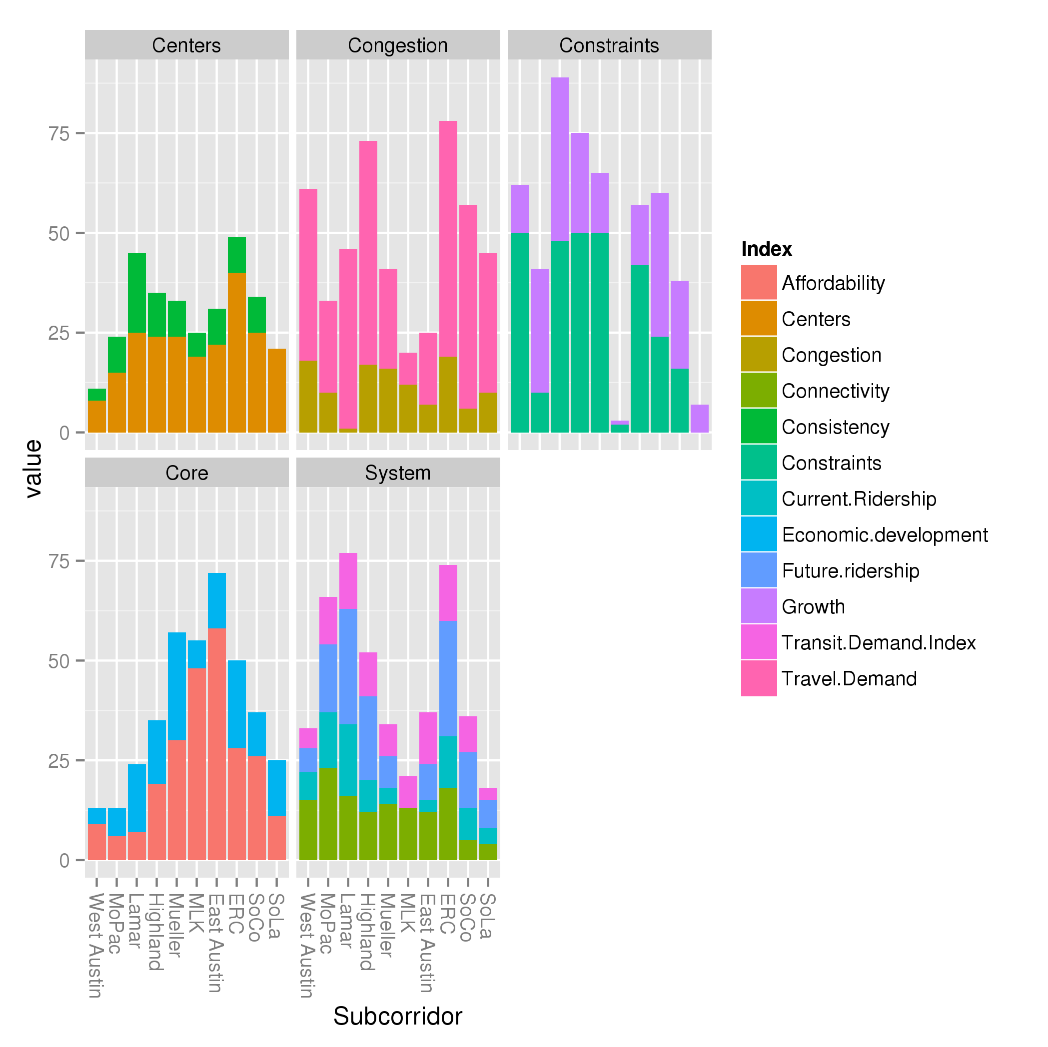
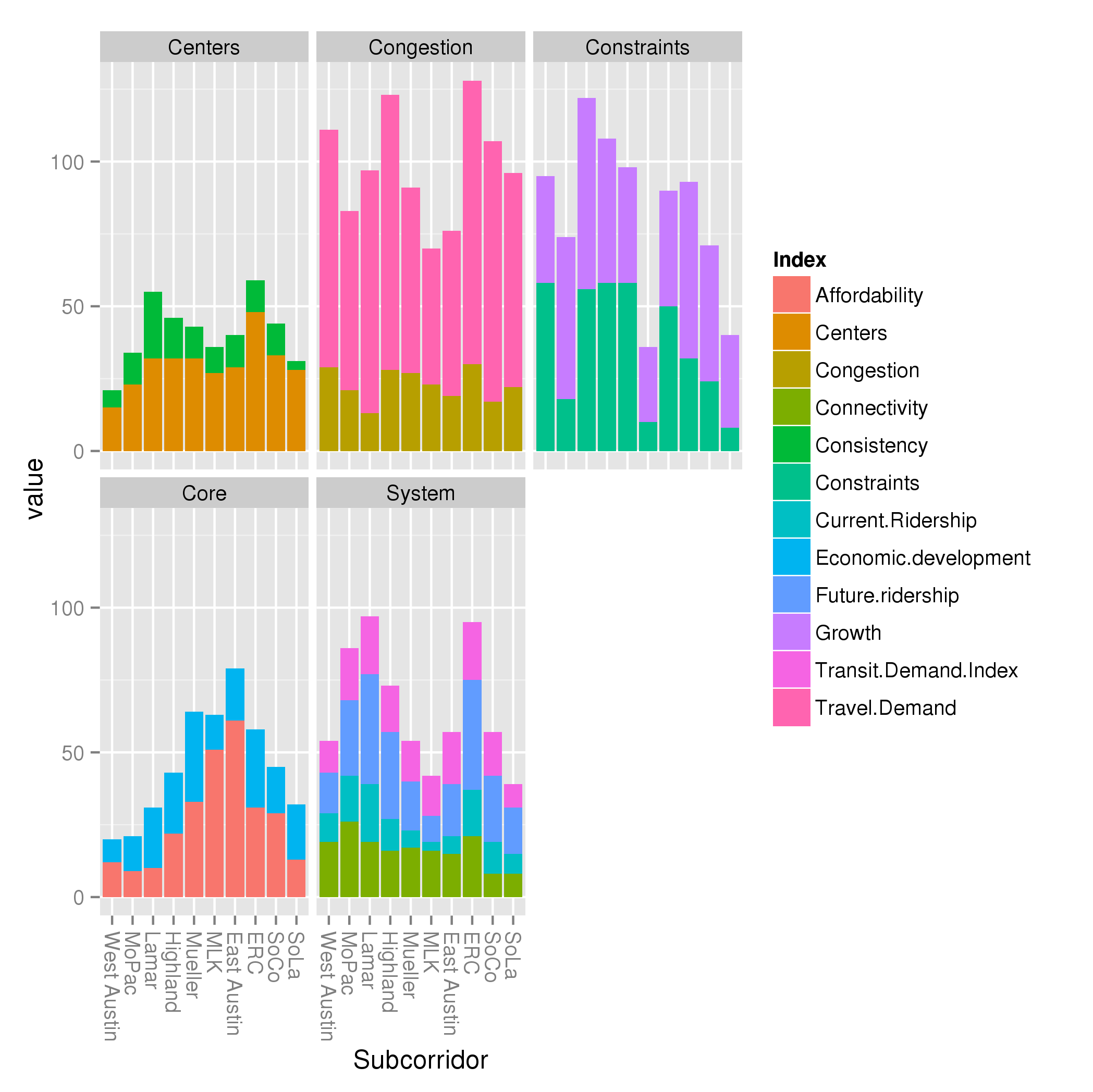
I also present Project Connect’s criteria, broken down by index (using min-max and max-only normalization):


What else do we learn from this?
- Constraints and growth is a ridiculous category for getting a handle on subcorridor performance. These are two unrelated indices thrown together for no good reason.
- Similarly, the System criteria is mostly Ridership, but oddly diluted by throwing the unrelated Connectivity index in it.
- The “Core” metric is almost entirely affordability, along the familiar compass pointing East toward affordability.


This is great. Is this accurate: The tradeoff with min-max vs. max is that with the former (PC’s methodology) you accent the differences between the subcorridors for purposes of comparison, but you minimize the actual differences between them for purposes of actual scale of difference.
Yes, with a caveat.
I haven’t done much of a dig into what the indices actually measure, so it’s possible the “differences” are already things that aren’t easily comparable. Saying that something is “half as dense” makes perfect sense; if something is “half as congested,” it’s not totally obvious what that even means.
That means it’s half as trafficky, obv 🙂