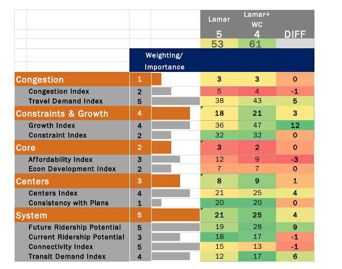
Project Connect has released a new FAQ. In it, they show a comparison between Lamar with West Campus and without:
Somehow, my numbers don’t add up the same as their numbers. Any number of reasons could cause this discrepancy: I could have made an error in my hurry; their spreadsheet could not match the data they are using; I have found one such instance so far, but in that case, it was obvious. A less obvious difference could easily have gone unnoticed. They could’ve made an error, or they could be using a subtly different methodology than the one I believed to have reverse engineered.
However, the table they have produced above is at best sloppy. At worst, it shows a lack of understanding of their own methodology and its implications. Every single measure that Project Connect has produced has been normalized: that is, all the scores are rebalanced from 0 to 1, with the lowest-scoring subcorridor ranked 0, the highest 1, and the rest in between.
The “Diff” column in the above chart is not always meaningful, because each number in the “before” column and the “after” column may be set on different scales. For a trivial example, take the “Consistency with Plans” index. Lamar’s score without West Campus was 6. 6 was the highest score of the 10 subcorridors, so normalized, it becomes 1, and scaled up it becomes 20. After adding in West Campus, Lamar’s score is 8. This is of course still the highest of the 10 subcorridors, so normalized it also becomes 1, and scaled up it is still 20. Lamar adds 0 to its score, as shown above.
However, scores only have meaning relative to one another. East Riverside has a pre-normalized score of 4, a normalized score of 0.60, and a scaled-up score of 12. After inclusion of West Campus in Lamar, it’s new normalized score is 0.43 or, scaled up, 9. So, although Lamar’s “score” didn’t go up as a raw number, it did improve by +3 relative to East Riverside. Consistency with Plans is an unimportant, lowly-weighted index. However, Future Ridership Potential is neither. When including West Campus, Lamar scores highest on this metric as well. That means that the “+9” difference is actually higher than +9, relative to the other subcorridors.
Unfortunately, these issues pervade the analysis. Sloppy use of language in communications and sloppy charts such as the above don’t necessarily mean that their metrics chose the wrong subcorridor; it could just mean that they don’t take the time to write accurate communications. However, it’s hard not to lose confidence in the choices that they made when they make elementary mistakes in the way that they present it. Did they think through the implications of choosing to normalize from min to max, rather than what seems like the more obvious choice of 0 to max? I would like to give them the benefit of the doubt that they had a good reason, but when I see sloppy charts like the one above it definitely shakes my confidence.
Update
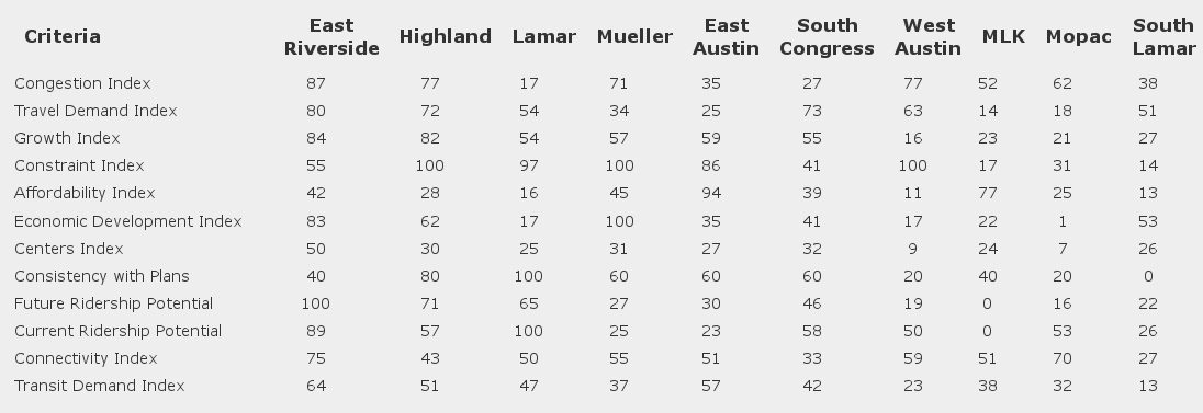
So I set out to figure out where I disagree with Project Connect. And, the first thing I find is data inconsistency between Project Connect’s online tool and the spreadsheet they released, on the very measure I discussed above:
Note the ERC’s score for consistency: 40 (0.4) on the online tool, and 0.6 in the spreadsheet. This is the second such issue I’ve found; the first was an error in the spreadsheet. Trying to reconcile difference between your calculations and theirs is nothing if not frustrating when there are data differences between two different versions of their own. Identifying issues such as this are relatively easy in the Consistency criteria, as it consists of a single measure. If there are errors in other measures, identifying them will be much more difficult.
Update 2
I misread the Project Connect FAQ. My calculations are consistently very similar to theirs, and given the minor data issues like the ones above, I’m not surprised that they aren’t exactly equal. Their wording on the effect of adding West Campus to Lamar is very squirrely: “Nevertheless, the overall impact improves the standing of the combined area by one position.” From 3rd to 2nd. From behind Highland to in front. The same analysis as I found. How they can repeatedly say adding West Campus doesn’t make a material difference and also say that it changes which the top two scoring corridors are is beyond me.
Update 3
Project Connect has updated their comparisons:
This is a step in the right direction, I think, though I’m still not completely sure what this means; was this in a 11-way direct comparison? Or was Lamar compared to Highland successively with and without Lamar? (If so, there really need to be two columns for Highland: before and after.) I did notice a disclaimer in a chart in Kyle’s presentation to CCAG that “numbers in columns cannot be compared to one another” which I appreciated.
But the basic message here is clear: inclusion or exclusion of West Campus makes a large impact on the final analysis.


2 thoughts on “Accurate charting and impact of West Campus”
Comments are closed.