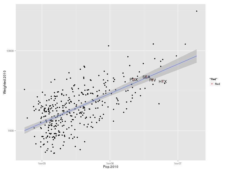
These two scatterplots show a relationship between population and weighted population density in Metropolitan Statistical Areas in Census data from the year 2000 and 2010. The fact that there is a positive correlation is not surprising. You need to cover greater distances and spend more time to traverse a city of 5,000,000 people in low-density buildings compared to a low-density city of 500,000 people. This makes density more alluring in the 5,000,000-person city.


What’s interesting is picking out cities which are above-trend and below-trend as having more or less density for their size. I have labeled 4 cities in each plot: HTX (Houston, TX), PDX (Portland, OR), SEA (Seattle, WA), and RIV (Riverside, CA), because these were the four cities picked out in the post that inspired this one (http://www.newgeography.com/content/003856-the-evolving-urban-form-portland#comment-form). The data is drawn from the Census bureau (http://www.census.gov/population/metro/data/pop_data.html, Chapter 3). The “Red” label on the side is an artifact of my impatience and inexperience with my plotting software (ggplot2, a package for R).
I am not a stats guy, so I don’t know that there’s anything particularly good about my analysis here. However, I’m posting because I felt the use of naive density stats (neither weighted by population nor placed in the context of city size) in Wendell Cox’ post does a disservice to those trying to understand what goes into density. By my charts, Portland is not the densest of the 4 cities selected cities (that’s Seattle), but it is the densest compared to the density we would expect for a city of its size. Houston, which Cox labels Portland’s density cousin, is indeed only slightly less dense than Portland. But as can be seen easily on this chart, one of the reasons people think of Houston as “not dense” is that it’s not dense for a city of its size, not that it’s not dense at all. It’s far denser than most cities smaller than it.
Another thing that can be seen from this chart is that over the last 10 years, Portland has not only gotten denser, but it has moved further above the density line than the average city moved over those last 10 years.
The last thing that could be picked out is that all 4 cities picked out in the post were relatively mundane on the density front. Houston is the closest to an outlier, but other cities are much further away from the trend line, in both positive and negative directions. Portland is slightly denser than could be expected for a city of its size, but not by much.

What’s the R-squared?
.55 on each or so.