A better visualization of effects of West Campus and time weighting

In my first glance, I showed that the Project Connect weightings resulted in different recommended subcorridors depending on whether you included West Campus in MoPac and Lamar, and whether you used negative weightings for present-day or used positive weightings for present-day, even if those weightings are smaller than those you use for the future.

I have now put together a superior illustration for this effect here:Faceted Final Scores

As you can see, the choice to negatively weight present-day scores had a dramatic effect on the data excluding West Campus, pushing Highland and Lamar from a virtual tie (upper left) to Highland higher-rated (bottom left).  This is not surprising, as Project Connect’s methodology shows Highland as targeted for nearly 3.6% annual growth in population density.

When West Campus is factored into the mix, the effect continues.  However, this time the effect of the negative present-day weightings was smaller.  With a more balanced weighting (upper right), Lamar is the clear winner and Riverside second.  With the negative weightings, Lamar is second to Riverside’s first.  In both cases, Highland places third.

I still believe that Project Connect’s methodology for calculating the final score to be confusing and inferior to the more traditional weightings I employed here; one of the reasons for this is that their complications makes effects like these extraordinarily hard to understand at an intuitive level.  However, it is noteworthy that their data and methodology draw the same conclusions that mine did (Lamar and Riverside the top two subcorridors) when you include West Campus, and that it ranks Highland and Lamar as equal even excluding West Campus, if you just correct for the negative weightings of present-day data.

Breaking it down and building it back up

Yesterday, I started the process of replicating the Project Connect process, in order to understand the thinking behind their recommendation better.  I found in that process that making a few tweaks could change the outcome, but I didn’t gain a ton of insight into why the subcorridors scored as they did.  The point of using numbers to do analysis is not because numbers are impartial–numbers embody whatever biases the person using them brings to the table.  The point of using numbers to do analysis is to facilitate understanding–to tie empirical information to analytical categories.  So, I decided to break the final scores down by criteria and chart them.  BaseProjectConnect


As you can see from this chart…nothing.  Maybe you have a better understanding of Project Connect’s criteria than I do, but even months into this process, living and breathing this information, I have no intuitive understanding in my head of what these criteria mean, so these numbers aren’t really aiding in my understanding or decisionmaking.  So, I decided to come up with some criteria that answer some distinct questions of mine.

The questions I came up with (partially guided by what data is available from Project Connect) are as follows:

  1. Congestion How trafficky are the streets in this subcorridor?
  2. Connectivity A bit of a catch-all criteria measuring how closely this subcorridor aligns with other objectives of city planning.
  3. Cost How much will it cost to build a train in this subcorridor?
  4. Ridership Last, but obviously, not least, how many people can we reasonably expect to ride a train in this subcorridor?

So, I rejiggered the Project Connect indices to match these four new criteria.

  1. Congestion I used the same two indices that Project Connect did: Travel Demand Index and Congestion Index, at the same relative weighting (5:2).
  2. Connectivity I used five indices, all related to the question of city objectives.  I weighted the Affordability  index (which relates to legally-binding Affordable Housing), the Economic Development Index, and the Connectivity Index (which relates to sidewalk / bicycle / transit connectivity) all the same.  I gave half-weightings to the Centers Index and Consistency Index, both of which relate to how much transit is anticipated in official city plans, one using Imagine Austin criteria and the other using neighborhood plans.
  3. Cost I used a single index, the Constraint Index, which attempts to give a rough estimate of costs by counting costly things the train will have to cross: highways, lakes, creeks, etc.
  4. Ridership I used three indices to answer this question, all equally weighted: Future Ridership (an estimate of transit demand developed in Portland, Oregon based on projections of future residential, employment, and retail densities), Current Ridership (the same based on measured densities), and the Transit Demand Index (a homebrew formula similar to the other two, but including current ridership).

In putting this together, I used 11 of the 12 indices that Project Connect did.  I dropped the “Growth Index” as future projections are already embodied in indices such as the Future Ridership Index and the Congestion Index (which includes projected 2030 congestion measures).  Accounting for growth in its own index is what led Project Connect’s analysis odd results.  However, by organizing them along lines that answer clear questions in my head, I’m able to use them for easier analysis and not just scorekeeping.  This is what the chart looks like:

Answer my questions about each subcorridor, excluding West Campus from Lamar and MoPac, not correcting for "growth" issue.
Answer my questions about each subcorridor, excluding West Campus from Lamar and MoPac, not correcting for “growth” issue.

Now we’re getting somewhere!  This chart tells stories.  What I see here is that Riverside and Highland (including I-35, Airport, and Highland Mall) are the two most trafficky subcorridors.  Five subcorridors are relatively low-cost: East Austin, Highland, Lamar, Mueller, and West Austin.  Riverside is higher cost, and South Lamar would cost the most.  Which subcorridors interact well with other city priorities is pretty much a wash, with Riverside and Mueller scoring the highest.  Riverside and Lamar would have the highest ridership, with Highland establishing itself in a solid third.

Now, another view, this time with West Campus included in the Lamar and MoPac subcorridors:

Answering my questions, this time with West Campus included.

This tells another story: both the Lamar and MoPac subcorridors have seen large increases in ridership.  In this view, it’s clear that there are two major routes for high transit ridership: Lamar and Riverside, in that order.  Highland has decent ridership, but even building the low-ridership MoPac subcorridor would have higher ridership, just because it would go through the super-high-ridership West Campus neighborhood.

Analysis

Based on these charts, Lamar and Riverside seem frankly head-and-shoulders above the rest of the subcorridors.  I could construct “final scores” for each subcorridor, but why bother?  The key reason I say that lies in the interpretation of the “Congestion” Question.  The question that the Congestion chart answers is not: how much congestion would be relieved in this subcorridor if we built a train here?  The question is: how trafficky is this subcorridor?  Put another way, congestion is both a blessing and a curse: it shows that there is high transportation demand, but it also shows strong automobile orientation of the infrastructure.  Between two subcorridors which promise high ridership–now and in the future–and two subcorridors which promise to be congested–now and in the future–I opt to send the train where the people will ride it.

Caveats

This analysis is only as good as the information that went into it.  As Julio pointed out, for the future criteria, there’s reason to doubt that is true.  In addition, though I have rejiggered the criteria to more closely answer the types of questions needed to analyze the subcorridors, I haven’t yet dug into the individual indices much to see if the measures they use to answer their sub-questions make sense.

Again, this was coded in R and code will be furnished upon request.

A first glance at Project Connect data

Project Connect has generously shared most of its intermediate findings. I took the opportunity to look over some of their work over the last couple days. It’s a complicated task, as they included a vast number of measures, far more than truly needed for the task. In deciding how to report its results, AURA has disagreed with Project Connect on a number of areas.  Some of these include:

  • After it began its analysis, Project Connect decided to change the definition of the subcorridors, such that the population-rich, transit-heavy West Campus was no longer included in the Lamar and MoPac subcorridors.
  • Project Connect not only overweights future measures compared to present measures, it actually underweights present measures so much so that, in many areas, a subcorridor projected to have more congestion or density in 2010 and 2030 may be ranked lower than a subcorridor with less congestion or density in both time periods, just because the weaker subcorridor is projected to add more people.  Put another way, in their methodology, two birds in hand are worth one in the bush.  See my previous post for details.
  • Project Connect included I-35 information in the congestion figures for many of the subcorridors, without regard to whether a more significant fraction of highway drivers are nonlocal and less likely to get out and use a train than locals.

I have rerun Project Connect’s scoring methodology to account for each of these issues.  I found that highway data was not important for congestion measures, and resulted in similar measurements to Project Connect’s.  However, both the hyper-overweighting of the future and the exclusion of West Campus data were significant issues with Project Connect’s methodology, masking the strength of the Lamar subcorridor to the benefit of the Highland subcorridor.  Merely removing the hyperoverweighting of the future, but keeping the future weighted stronger than the present, and including West Campus in the analysis, results in the intuitive result that the Lamar subcorridor is ranked highest, East Riverside second, and Highland, Mueller, and East Austin lumped together.

I’m not going to say that these are the final results I believe in yet.  It wasn’t until I dug into Project Connect’s methodology that I noticed some of the strange preferences they embody, such as the hyperoverweighting of the future compared to the present.  Most likely, using a bottom-up method of selecting a few of the most salient measures from their analysis will be more productive in making a final selection, something that Julio has started very ably.

However, my analysis here makes one thing clear: the repeated assertion that the numbers point to the same conclusion any which way you dice them is nonsense.  It actually takes torturing the data quite a bit to result in the particular recommendation that they did: merely failing to hyperoverweight the future to the present or failing to exclude West Campus from the analysis changes the results materially.

Methodology

I downloaded the data from Project Connect.  I used the measure weightings from this document and the index weightings from this document.  I validated my intermediate results by using the weightings from the survey.  For the West Campus data, I used the “West Campus” tab with only one change: I set the “consistency” measure for MoPac and Lamar subcorridors to 4 and 8–adding in the “2” result for West Campus with the original “2” and “6” results for the two subcorridors, in place of the 0’s in the spreadsheet, which I believe was in error.  For the “overweighted future” scores, I set the weightings for all measures that were “increase from 2010 to 2030” to “0” and left the 2030 and 2010 weightings alone.  (2030 was already overweighted compared to the present; it was the increase that was responsible for the hyperoverweighting.)

I will continue to try to do analysis on this so that we can understand a clear story about what the data means, and not just “what are the final results.”  If you have particular questions you’d like me to answer, please let me know in the comments or on twitter or any which other way you know to reach me.  The code is in R and is available upon request.

A little oddity in Project Connect Evaluation Criteria

I was reviewing the Project Connect evaluation criteria, when I noticed a bit of an oddity:

Lane miles contribution

In examining congested lane miles, 2010 congestion data counts 3%, 2030 congestion projections count 5%, and the difference between the two counts 4%.  Making the difference between the projections and the real-world data count more than the real-world data means that not only does 2030 count more than 2010 data, but, given two subcorridors with the same 2030 projections, the one with less congestion in 2010 is measured as worse.

Note: The columns 2010 and 2030 are measured in %’s.  The weighted columns consist of the previous column, multiplied through by the percentage it counts toward the total and then by 100 for readability.

Name 2010 Weighted Increase Weighted 2030 Weighted Total
A 3 9 17 68 20 80 157
B 17 51 3 12 20 80 143

To repeat, Subcorridor A and B are tied in the 2030 metric, Subcorridor B was measured as more congested in 2010, but in total,  Subcorridor A is measured as more congested.  You could even construct examples where A was more congested than B in 2010 and 2030, but B is measured as more congested overall:

Name 2010 Weighted Increase Weighted 2030 Weighted Total
A 26 78 5 20 31 155 253
B 5 15 25 100 30 150 265

To repeat, in this example, Subcorridor A is more congested in both 2010 and 2030, but the Project Connect evaluation criteria measures Subcorridor B as overall more congested because it shows a large increase.  I could potentially construct a rationale for this: perhaps the increase between 2010 and 2030 represents a trend that will continue out into the future beyond 2030.  But this would not be a recommended use of the model; there are reasons we don’t use simple linear extrapolation in the model in the first place.  This odd situation could be avoided by simply not including the increase as a metric at all.

What effect did this have overall on the results?  I’m not sure; the individual scores for each subcorridor have not yet been released.  I really can’t predict how the scores would’ve been affected.  I will be speaking with Project Connect soon and hope to hear their rationale.

Update: The original Example 2 was messed up.  This version is fixed (I hope!).  Update 2: Improved readability by expressing things as percentages rather than decimals.

Update 3: For a little more discussion of this, you could break up the 2030 projections into two components: Base (2010) + Increase.

If you consider just 2010 data (as FTA suggests), you are going 100% for Base, 0% for Increase.

If you consider half 2010 data and half 2030 projections  (as FTA allows), you are going 75% for Base and 25% for Increase.

If you consider just 2030 projections, you are going 50% for Base and 50% for Increase.

But using Project Connect’s weightings here, you are weighted at 46% Base, 54% Increase, even more weighting on the increase than if you had just used the projections themselves.

The exact same issue applies to the “Growth Index”, in which a 50%-50% weighting between Increase and Future yields a 25% weighting for the Base and a 75% weighting for the Increase, the flip weighting of what the FTA suggests.

How to measure “shaping”

Summary: To measure how much “shaping” a rail plan does, don’t look just at static 2030 projections.

In the latest Central Corridor Advisory Group meeting (video here), there was an interesting question of whether the most important numbers that Project Connect should use when evaluating potential rail routes are the data from 2010 or the CAMPO projections for 2030.  Kyle Keahey, Urban Rail Lead for Project Connect, framed this decision as “serving” existing populations or “shaping” land use patterns and future growth.

Serving and shaping are both valid but aims of a new rail plan, and each goal might be achieved to a different amount by different plans.  However, the way to measure them is not the 2010 data vs. the 2030 projections.  The 2030 projections are based on the Capital Area Metropolitan Planning Organization (CAMPO) model, which I do not believe included any provisions for rail.  Therefore the growth it projects, according to the model, is coming even if we don’t build rail.  Building toward that growth is still a mode of serving, just serving a future population, projected to exist even in a no-build scenario.

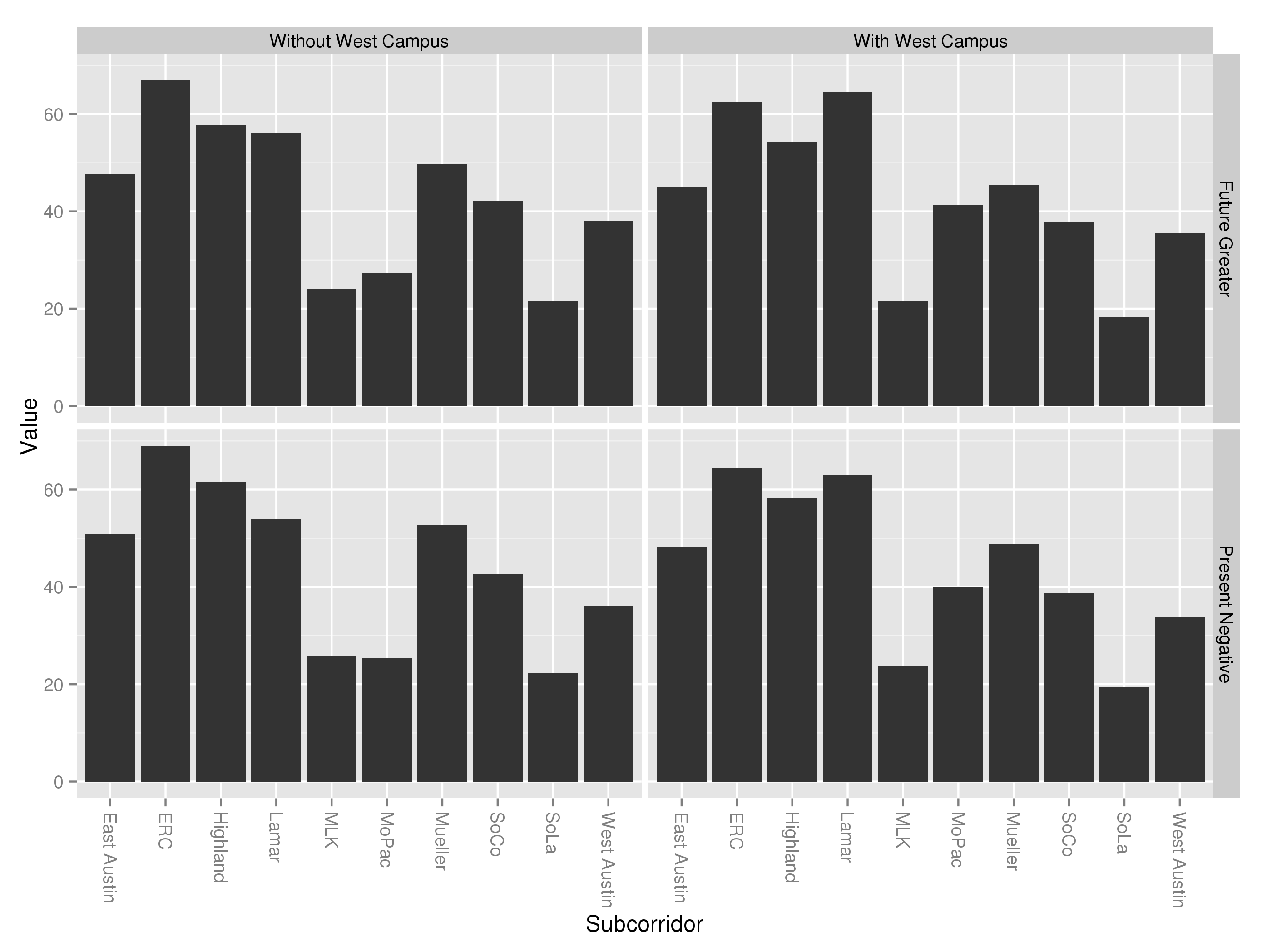
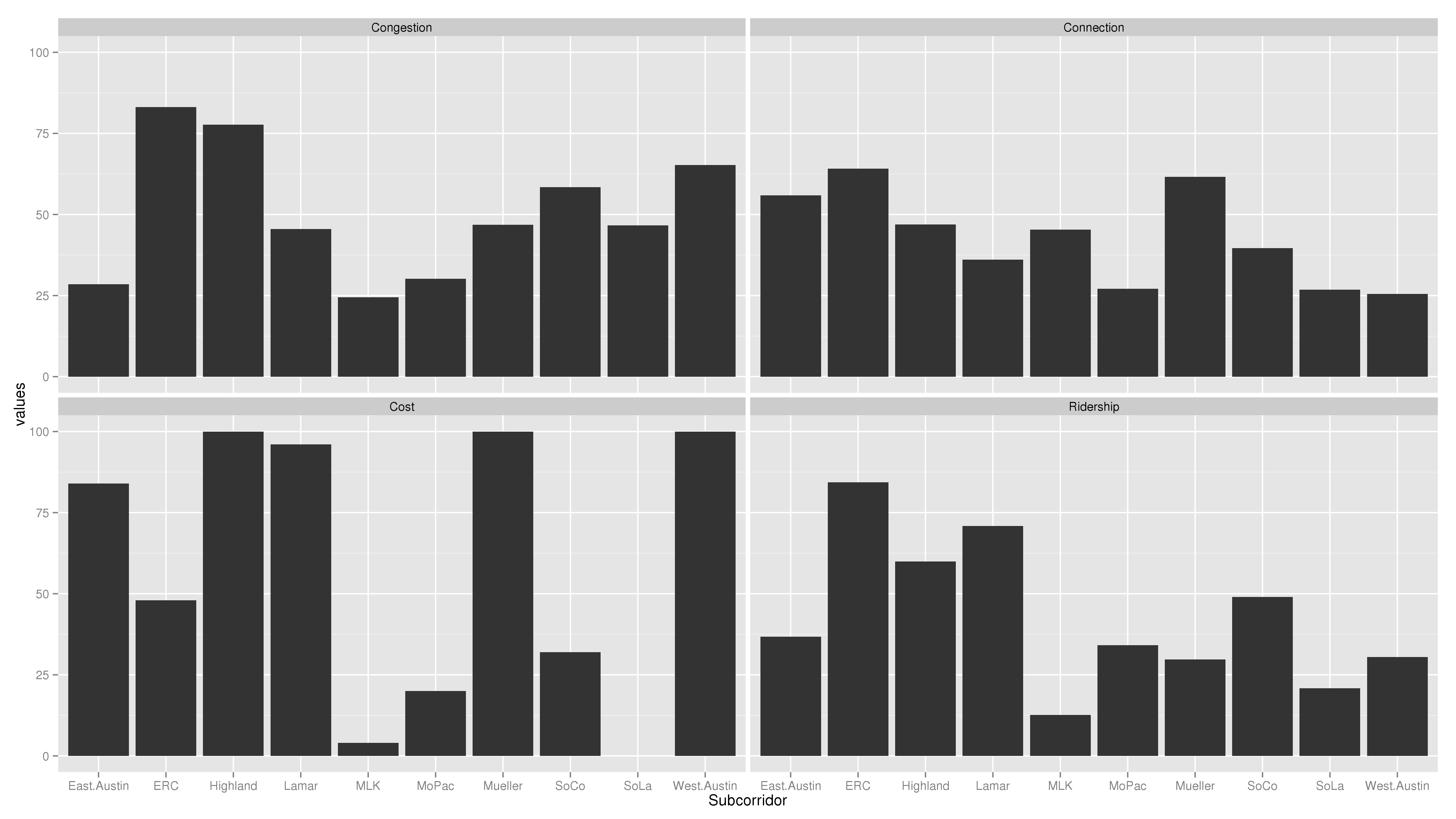
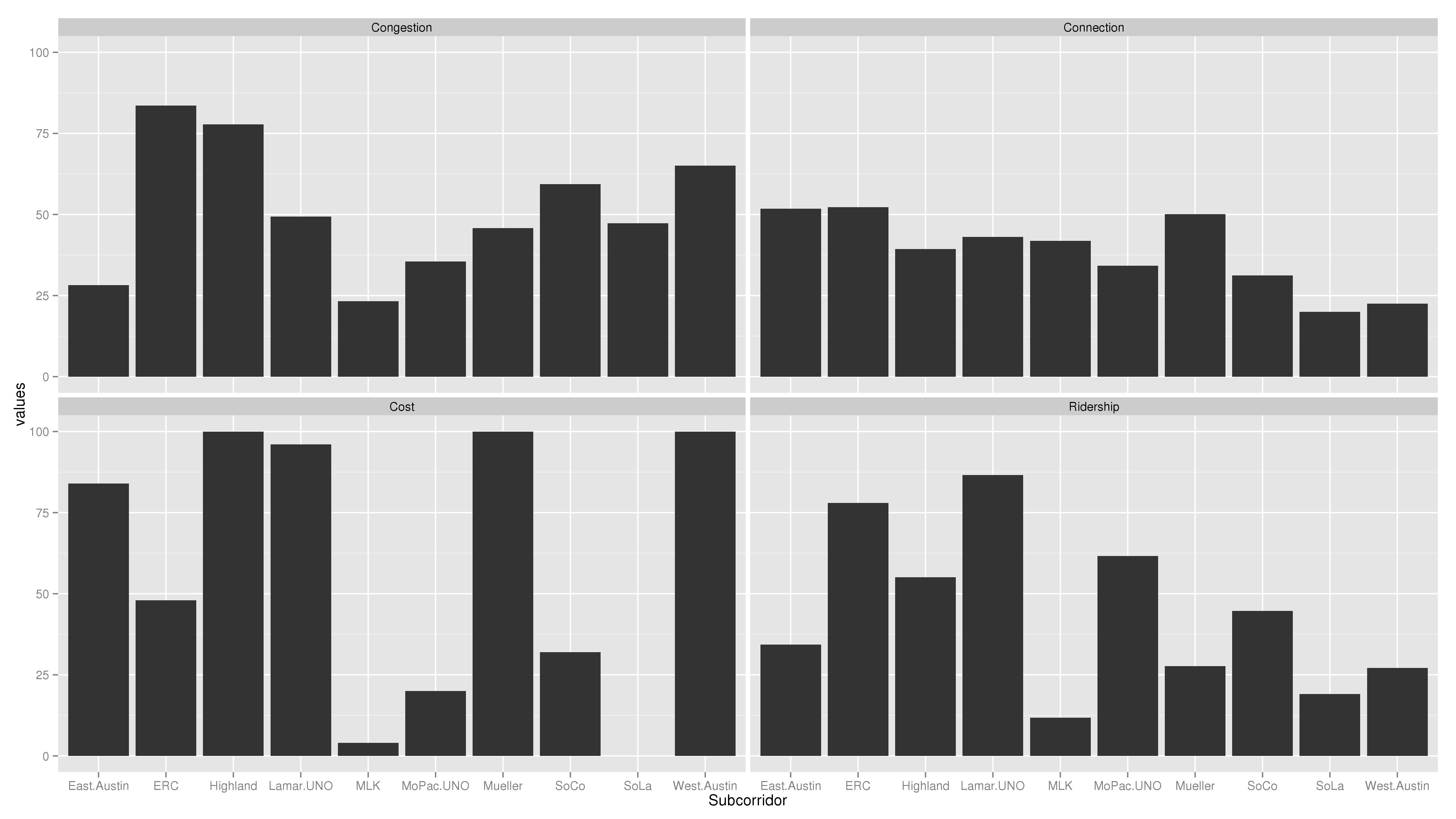
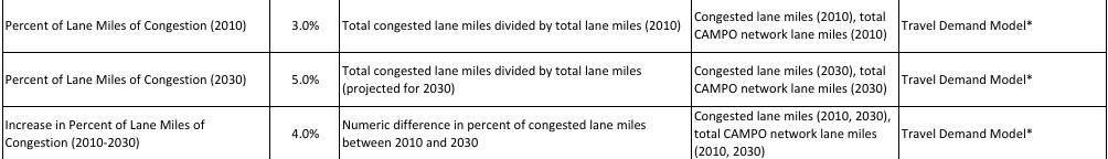
But these projections aren’t set in stone.  Areas might grow faster or slower than assumed or even lose population.  Sometimes, changes in projected growth can be for reasons that nobody anticipated: Seattle’s Eastside suburbs would probably never have grown so fast if it weren’t for the explosive growth companies like Microsoft experienced.  But often, the changes in growth are due to policy decisions.  West Campus, for example, experienced explosive growth when the UNO zoning plan came into existence, allowing growth to occur.  The East Riverside Corridor plan that City Council passed is similarly all about shaping the nature of future growth along that corridor.  The “CAMPO model” (PDF) doesn’t actually consist of one projection, but two: one based on a no-build scenario and one based on a “financially constrained” scenario.  By comparing projections based on each transportation plan, CAMPO is analyzing how each plan shapes the future.

If the Central Corridor Advisory Group is being asked to shape the future and not merely serve, it will need similar alternative projections.  There may not be time to perform as sophisticated an analysis as CAMPO does, but it at least needs to be aware what sorts of questions it’s trying to answer.  Questions like: if we put rail here, will that result in more people living there?  Working there?  Living there without cars?  The answers to these questions are difficult, but shying away from them or assuming answers because the questions are difficult is not a good way to make decisions.

After all, if we don’t believe that spending $500m on a rail system will change the projected future land use and transportation patterns of our city, we might as well save that money and not build it at all.  I think rail is one foundation for shaping the city and that’s why we’re pursuing this process.  But that means that, instead of merely chasing one static, no-rail projection of 2030, CCAG should be planning what 2030 will look like.

Rail alone can’t achieve that plan.  If a neighborhood is as built out as zoning allows it to be, then frequent, high quality rail service will not draw new residents, merely raise property values and make the area less affordable.  That is why I think it should be clear to residents that, if we are planning on building a rail line to your area, that will have to go hand-in-hand with reshaping your area to be amenable to rail, by including high-density zoning, high grid connectivity, and all the other elements that are necessary to make a rail line successful.

Edit: After I posted this, Jace Deloney took to twitter to make some excellent points about this post.  Read the storified version here.  One point he made was that we should look to serve places “that already have the sort of density & zoning that can support high transit service.”  I agree!  Sending rail to places where it is needed and that will make the best use of it is the right move!  I just want to point out that if you are going to try to shape a place with rail, you should use at least use measurements of shaping that make sense, and not static projections.

The point I was trying to, but failed to make in the final paragraph was not that sending rail to already-built places is wrong–indeed sending rail to already-built places is the best guarantee that by the time you build it, there will be people there–but rather, that your future growth projections should be in line with land use law.  If the law doesn’t allow for the kind of growth you are projecting, you are making projections not only about future consumer demand for living spaces, but also about what future City councils will pass.  Perhaps that makes sense for a private-sector forecaster, but for the City Council itself to pass the plan, the Council should either go ahead and pass the law that allows for that growth or it should not use that growth in its projections.

A walkability agenda for Austin

Friday night, I had the pleasure of attending WalkAustin’s first ever Happy Hour and meeting many wonderful people interested in making Austin more walkable, including many who work for municipal government.  As this blog gets its name from the nexus of walking and activism, I’ll take this happy occasion to start setting out an agenda for improving walkability in Austin.

This is preliminary.  I’d love feedback and filling in details!  I’m covering a lot of issues I only know in passing.  Also, this is an agenda for plausible things that would improve walkability.  Some of them may conflict with other goals you have; that’s fine.  Walkability isn’t the only goal in setting public policy.

Continue reading

What I learned from meeting with Capital Metro on fare changes

After I posted some questions of Capital Metro regarding their fare restructuring proposal,  I was invited to come speak with representatives of Capital Metro and their fare change consultant today to seek further answers and clarity.  What follows is a dump of my memory of the highlights of the meeting:

  1. It was confirmed that the consultant was not tasked with assessing whether or not to raise fares.  That decision had already been made by Capital Metro as part of its long-term budget assessment, driven by the board’s (completely unrealistic, absolutely ridiculous) goal of a 20% Fare Recovery Ratio.
  2. The consultant never seriously considered a local base fare other than $1.25.  The fare had to increase (per Capital Metro’s instructions), it couldn’t increase in increments of less than a quarter due to simplicity constraints, and it couldn’t increase by $.50 due to political constraints.  $1.25 was the only option.  The revenue and ridership impact table was calculated for completeness after the fares were set, not as an input into the decision-making process.  This truly was a red herring for me.
  3. I emphasized that the point of Capital Metro releasing its materials should be to inform the ultimate decision-makers (both the board and the public) and help them make a decision.  As such, the chain of reasoning behind the decisions made should be presented.  Capital Metro employees countered that: a) 1-1 meetings such as the one I was in were part of the public input process; b) I was the only one who had asked these sorts of detailed questions.  For those of us who want to see a data-driven revolution in municipal decisionmaking, this shows how important it is to make our voice heard at every turn.  As long as there is a belief that nobody out there cares, nobody in the decision-making apparatus will go the extra mile to release good documentation.
  4. When I discussed why I don’t like FRR as a metric, the only defense offered was a political one: transit is under constant attack, so it needs to prove its efficiency.  I think this is a very bad misreading of the politics of transit.  Recovering 8-10% of operating costs as fares is not impressive to anybody; nor would 20% be.  Transit opponents will not be mollified by hearing that fares are only subsidized 4-1, an FRR goal that would render Austin transit completely ineffective.  There was no defense offered of FRR as a useful metric for making efficient transit decisions.  I think it is telling that FRR is seen as a political metric and yet it is the only metric that filters all the way down to the most technical decisionmaking documents.  This is a true triumph of anti-transit advocacy.
  5. Many of the same discussions that are had in twitterlands (e.g. should passenger subsidy be displayed next to FRR) are had within Capital Metro itself.   It would be wonderful to see the technical employees of the agency engage with outsiders at a technical level, rather than hold their own parallel conversations.
  6. My general proposal to use models other than transit agencies for governing the running of Capital Metro seemed like a foreign language at times.  For example, I expressed the idea that most organizations decide whether to raise revenue at the margin based on its projections for what it will do with the revenue and whether it’s worth the cost.  Eventually, we came to the conclusion that this step had been done in setting the long-term budget, rather than in setting the fare increases (although this idea was never clearly expressed in the fare restructuring proposal documents).  Or, similarly, asking what the FRR of a fire department or zoning office is, and why do transit agencies use this odd metric no other government agency would.  I’m not one to think mindlessly that government should be “run like a business,” but “because our peer agencies do it that way” doesn’t sound much better to me.  This is not something unique to Capital Metro, but no less the annoying for it.

I was impressed at the friendliness and expertise of the Capital Metro staff, but my main critique remains the exact same as it was at the outset: the chain of reasoning from principles to outcomes was never presented, let alone justified, in the public documentation on this proposal.  (FWIW, I don’t blame the consultant for this; it’s capital metro’s responsibility to communicate with the public.  If the consultant’s document is inadequate for that purpose, they should present another staff commentary.)  Having heard the actual reasoning only reinforces my belief in the necessity for this transparency.  Not because the reasons were bad; on the contrary, because many of the reasons were good!  If Capital Metro can’t even justify the decisions it makes for the right reasons, it will never get in the habit of justifying the hard decisions.

Transparency Means Show Your Work (fare change proposal, part 2)

In a previous post, I asked questions about the proposed changes to the fare.  The Capital Metro communications and public involvement team at Capital Metro forwarded them to the people doing the original analysis, and I got some responses:

 1. What, if any, are the projected changes in costs associated with each of the proposals?

There are always costs associated with a fare increase, in particular with reprogramming fareboxes and ticket vending machines to reflect changes to the fares and adding new passes.  In addition, there are production costs for printing new fare media, and costs for distributing the new fare media to the retail outlets.  There are also costs for new overlays to the Operator Control Units (OCU) and informational labels on the fareboxes and the labor associated with placing them on the equipment, including the ticket vending machines.  Could be as much as approximately $10,000.

2. If there are no projected changes in cost, by what analysis do you consider it worthwhile to eliminate 117,000 MetroAccess rides to gain a negligible  $9,000?  If there are projected changes in cost, how do you expect the public to judge this proposal without providing the data?

$2.6 million per year savings in reduced operating costs due to reduced demand. Revenue is the not the main goal of this proposal, it is equity and demand control.

3. Is the additional revenue and lost ridership for changing premium service to $1.50 measured against the current baseline or the baseline of a change to $1.25?

Measured against current $1.00

4. What would the revenue and ridership numbers be different if you had adjusted the MetroBus fares to $1.10 or $1.50?  Presenting only the selected numbers gives us little room to judge the proposal by.

The numbers would be different if we had raised the fares more or less.

5. How will day passes work when transferring between premium and base service?

Currently, whether your swiping a Local Day, 7-Day or 31-Day on an express bus, the farebox will prompt you for an upcharge (per ride) of $1.35 (full fare) or $0.65 (reduced fare).  Being that a Premium fare has yet to be determined, the upcharge has yet to be determined, as well.

However, the logistics would be…customer with a local pass boarding a premium bus, the upcharge would be less than the upcharge for boarding an express bus with the local pass.   And if a customer with a premium pass boarding an express bus, the upcharge would also be less than boarding with a local pass.  On the other hand, if boarding a local bus with a premium pass, there would be no upcharge.

As always, a Regional pass is valid on all bus and rail services.

6. Will different fares between MetroBus and MetroRapid cause difficulty in advanced payment facilities, such as the promised smartphone app to prepay MetroRapid?  If passengers opt to pay cash, will this slow MetroRapid down?

Smartphone apps handle multiple fares quite easily.

Cash fares will continue to be accepted on all MetroRapid buses, however; although customers can board and alight from the rear doors on all MetroRapid buses, customers paying cash fares will still require boarding through the front door where the farebox is located.  Rear door validators will not accept cash.

7. You dismiss collecting payment for parking as too difficult logistically, yet 100s of private operators consistently collect parking payments for much smaller lots than Capital Metro operates.  If you don’t believe Capital Metro is capable of operating as well as them, did you consider outsourcing the job to one of them?

 Yes, you could outsource. Cap Metro likely would spend more collecting the parking fees than they would earn, even with an outside operator.

I found these answers… rather lacking.  The point of asking for answers in the first place was that I wanted the people who did the analysis to show their work, to explain how they chose $1.25 and not $1.50 for local bus service, how they chose $1.50 and not $1.25 for premium bus service, how they chose free parking and not paid parking.  None of the reasons behind these decisions can be gleaned from their answers, with the exception of question 2.

Regarding Question 1, I would like to know changes in operating costs, not the capital cost of the switchover.

Regarding Question 3, they fail to answer the obvious follow-up: why $1.50?  How would the calculations have been different if they had selected a different fare?

The answer to question 4 is frankly insulting.

They didn’t seem to understand question 5 (I was asking about those who hold a day pass, not those who hold other passes and are purchasing a day pass).

And the answer to question 7 seems to read that they did not do any analysis regarding the ability to collect parking fees, nor do they plan to do any.

I wrote the Cap Metro communications team back asking for follow-up, and I have received this back so far and a promise for more:

4. What would the revenue and ridership numbers be different if you had adjusted the MetroBus fares to $1.10 or $1.50?  Presenting only the selected numbers gives us little room to judge the proposal by.

I don’t think that looking at $1.10 or $1.50 in detail (estimating ridership and revenue) is really necessary at this point. Raising fares by only a dime is not worth the implementation effort and is rarely done anymore in the industry, particularly with such a low base fare. Raising the fares by more that 25% in one stroke is also uncommon because of the challenges and the potential burden on low income riders. I recommended the 25% base fare increase as being large enough to positively effect fare recovery without being so large as to be burdensome.

This answer is improved.  Although it doesn’t have the numbers comparison I was expecting for choosing $1.25 over $1.10 or $1.50, it does give the rationale: both other fares were eliminated by constraints, leaving $1.25 as the only plausible increased bus fare.   I await the rest of the replies to find out whether we get a rationale for the premium bus fare and evidence that paid parking is implausible.

I have been pushing for these answers not because I think the fare changes are egregious.  Neither is it because I believe Capital Metro is hiding a super secret analysis that has been done.  Rather, it is because I believe that transparency means “show your work.”  I would frankly be relieved to find out that there was an analysis that we haven’t been shown yet.  My fear, rather, is that the public, Capital Metro staff, and the Capital Metro Board will all be left with a take-it-or-leave-it proposal that explains the effects of adopting the recommended fare changes, but offers no analysis on any alternative such that anybody could be informed about other options for the choices they’re making.  I have trust that the people who prepared the fare change report are transit professionals. However: 1) the Board is the appointed decisionmaker, not the consultant, and therefore the Board should be well-informed about possibilities for their decision; 2) no decision is better made by one person or group without showing their work.

I look forward to further responses to my questions.  I will be attending the Capital Metro Customer Satisfaction Advisory Committee (CSAC) on Wednesday 8/14 to discuss these emails.  My current suggestion to improve this transparency is to add contract language to all committee reports asking not only for recommendations, but also all information and reasoning necessary to arrive at those recommendations.

Why you need to be careful when measuring “density”

These two scatterplots show a relationship between population and weighted population density in Metropolitan Statistical Areas in Census data from the year 2000 and 2010.  The fact that there is a positive correlation is not surprising.  You need to cover greater distances and spend more time to traverse a city of 5,000,000 people in low-density buildings compared to a low-density city of 500,000 people.   This makes density more alluring in the 5,000,000-person city.
20002010
What’s interesting is picking out cities which are above-trend and below-trend as having more or less density for their size.  I have labeled 4 cities in each plot: HTX (Houston, TX), PDX (Portland, OR), SEA (Seattle, WA), and RIV (Riverside, CA), because these were the four cities picked out in the post that inspired this one (http://www.newgeography.com/content/003856-the-evolving-urban-form-portland#comment-form).  The data is drawn from the Census bureau (http://www.census.gov/population/metro/data/pop_data.html, Chapter 3).  The “Red” label on the side is an artifact of my impatience and inexperience with my plotting software (ggplot2, a package for R).

I am not a stats guy, so I don’t know that there’s anything particularly good about my analysis here.  However, I’m posting because I felt the use of naive density stats (neither weighted by population nor placed in the context of city size) in Wendell Cox’ post does a disservice to those trying to understand what goes into density.  By my charts, Portland is not the densest of the 4 cities selected cities (that’s Seattle), but it is the densest compared to the density we would expect for a city of its size.   Houston, which Cox labels Portland’s density cousin, is indeed only slightly less dense than Portland.  But as can be seen easily on this chart, one of the reasons people think of Houston as “not dense” is that it’s not dense for a city of its size, not that it’s not dense at all.  It’s far denser than most cities smaller than it.

Another thing that can be seen from this chart is that over the last 10 years, Portland has not only gotten denser, but it has moved further above the density line than the average city moved over those last 10 years.

The last thing that could be picked out is that all 4 cities picked out in the post were relatively mundane on the density front.   Houston is the closest to an outlier, but other cities are much further away from the trend line, in both positive and negative directions.  Portland is slightly denser than could be expected for a city of its size, but not by much.

Why I don’t like FRR as a metric

In my last post, I discussed a possible metric to judge transit agencies by: mobility per subsidy.  In that discussion, I mentioned how that metric relates to and encompasses many of the other traditional metrics used to judge transit systems and prices, like equity/fairness and ridership.

Here, I’ll compare it to one of the cost-effectiveness metrics mandated by the Capital Metro board: Fare recovery ratio.  FRR is the ratio of all costs collected as fares: Farebox revenue / Total costs.  Unlike ridership or equity, mobility per subsidy does not encompass FRR; in fact, it actively conflicts with it and seeks to replace it.  There’s a reason for that: mobility / subsidy is a measure of efficiency, or benefit per cost.  FRR is not a measure of costs or benefits, but is instead a measure of the incidence of costs.

This is frankly an insane thing to measure.  For example, suppose MetroBus had a $100M budget to run 20 bus lines and collected $10M in fares and $90M from tax revenues.  This would be an FRR of 10%.  Then, one day, they discovered that there were tremendous revenue opportunities in running buses with wrap coverings.  So much, in fact, that 5 new buslines could be added that would completely pay for themselves, at a cost of $25M and revenues of $25M.  Now, MetroBus would be running 25 buslines with a $125M budget, collecting $10M in fares, $25M in ads, and $90M in tax revenues.  By mobility metrics, this is an unequivocal win: 25 buslines for $90M is much better than 20 buslines for $90M.  But FRR was actually reduced from 10% to 8%.  By FRR logic, fares should be raised because running buses became more efficient!  You might say that this is an odd case, but it should at least give you pause when your metric argues for you to do the exact opposite of the right thing.

Under the mobility per subsdiy metric, fares should not always be zero.  Assessing fares can be useful for two major reasons:

1) demand management, such as preventing rides that are of negligible mobility usefulness, such as rides for the benefit of air condition or one-block rides from crowding out rides that have positive mobility usefulness, and

2) Raising revenue.  As long as the revenue raised doesn’t interfere with the service provided (say, by making enough of the potential users avoid using it), this helps either return money to the taxpayers or increase mobility-providing services.  Either way, it can improve the mobility per subsidy metric.

These are similar reasons for charging fees across municipal government.  The Austin Planning Department charges a fee for submitting permits.  This both prevents frivolous filings (demand management), and raises revenue.  But it would be frankly insane to measure the effectiveness of the planning department using FRR (permit revenue / operational costs).  Raising permit fees for the purpose of increasing the planning department’s FRR could do real damage to the city by incentivizing people to either skirt the permit process, or else discouraging people from building altogether.

Similarly, raising transit fares for the purpose of satisfying an FRR metric could do real damage to the city by encouraging either fare evasion or reducing mobility and transit efficiency across the city.  FRR is a metric that should simply be ignored.  This doesn’t mean that it isn’t the Board’s responsiblity to ensure that taxpayers get good value for their money–it simply means that FRR is a terribly way of measuring that.