Yesterday, I started the process of replicating the Project Connect process, in order to understand the thinking behind their recommendation better. I found in that process that making a few tweaks could change the outcome, but I didn’t gain a ton of insight into why the subcorridors scored as they did. The point of using numbers to do analysis is not because numbers are impartial–numbers embody whatever biases the person using them brings to the table. The point of using numbers to do analysis is to facilitate understanding–to tie empirical information to analytical categories. So, I decided to break the final scores down by criteria and chart them. 
As you can see from this chart…nothing. Maybe you have a better understanding of Project Connect’s criteria than I do, but even months into this process, living and breathing this information, I have no intuitive understanding in my head of what these criteria mean, so these numbers aren’t really aiding in my understanding or decisionmaking. So, I decided to come up with some criteria that answer some distinct questions of mine.
The questions I came up with (partially guided by what data is available from Project Connect) are as follows:
- Congestion How trafficky are the streets in this subcorridor?
- Connectivity A bit of a catch-all criteria measuring how closely this subcorridor aligns with other objectives of city planning.
- Cost How much will it cost to build a train in this subcorridor?
- Ridership Last, but obviously, not least, how many people can we reasonably expect to ride a train in this subcorridor?
So, I rejiggered the Project Connect indices to match these four new criteria.
- Congestion I used the same two indices that Project Connect did: Travel Demand Index and Congestion Index, at the same relative weighting (5:2).
- Connectivity I used five indices, all related to the question of city objectives. I weighted the Affordability index (which relates to legally-binding Affordable Housing), the Economic Development Index, and the Connectivity Index (which relates to sidewalk / bicycle / transit connectivity) all the same. I gave half-weightings to the Centers Index and Consistency Index, both of which relate to how much transit is anticipated in official city plans, one using Imagine Austin criteria and the other using neighborhood plans.
- Cost I used a single index, the Constraint Index, which attempts to give a rough estimate of costs by counting costly things the train will have to cross: highways, lakes, creeks, etc.
- Ridership I used three indices to answer this question, all equally weighted: Future Ridership (an estimate of transit demand developed in Portland, Oregon based on projections of future residential, employment, and retail densities), Current Ridership (the same based on measured densities), and the Transit Demand Index (a homebrew formula similar to the other two, but including current ridership).
In putting this together, I used 11 of the 12 indices that Project Connect did. I dropped the “Growth Index” as future projections are already embodied in indices such as the Future Ridership Index and the Congestion Index (which includes projected 2030 congestion measures). Accounting for growth in its own index is what led Project Connect’s analysis odd results. However, by organizing them along lines that answer clear questions in my head, I’m able to use them for easier analysis and not just scorekeeping. This is what the chart looks like:
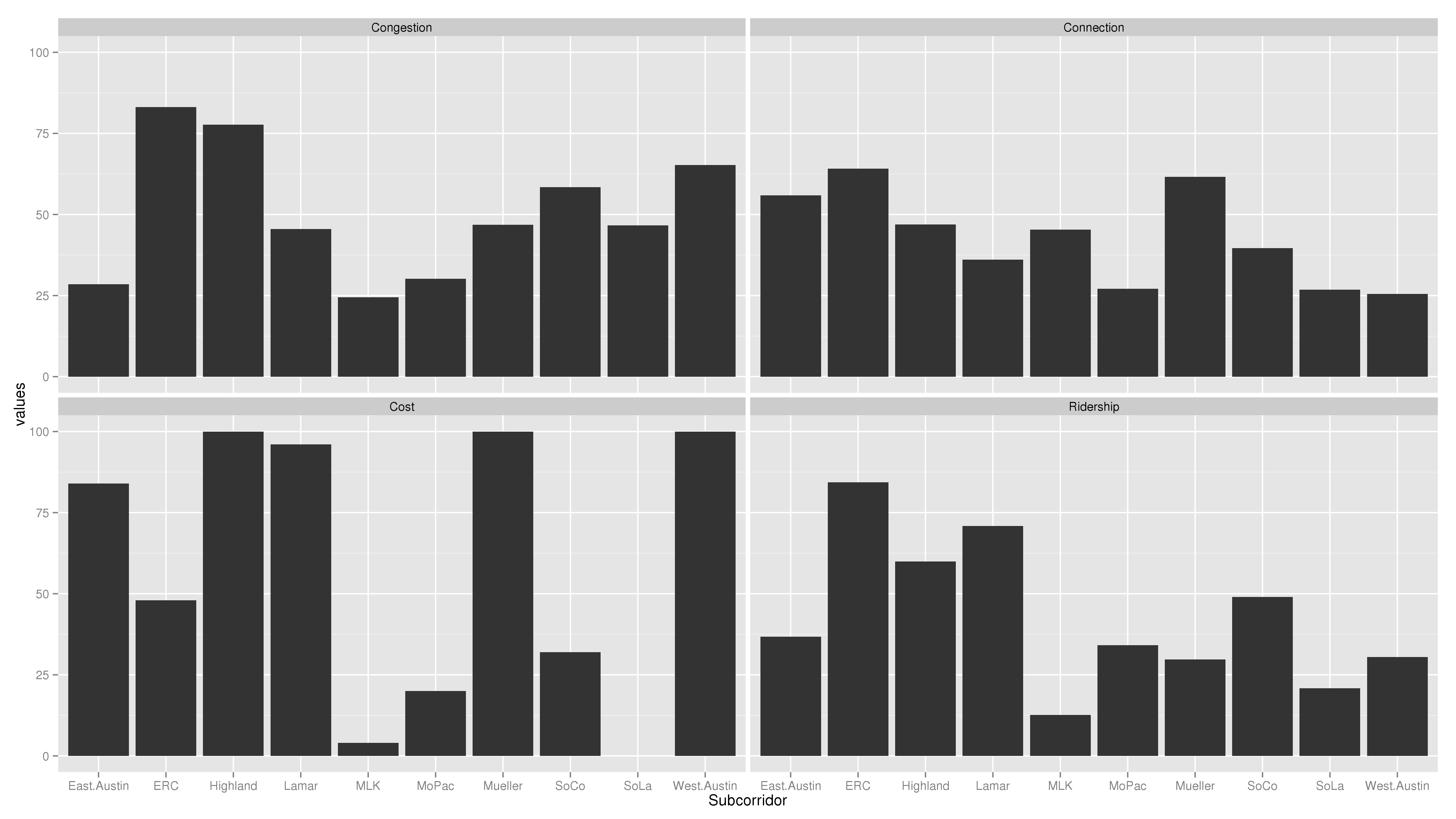
Now we’re getting somewhere! This chart tells stories. What I see here is that Riverside and Highland (including I-35, Airport, and Highland Mall) are the two most trafficky subcorridors. Five subcorridors are relatively low-cost: East Austin, Highland, Lamar, Mueller, and West Austin. Riverside is higher cost, and South Lamar would cost the most. Which subcorridors interact well with other city priorities is pretty much a wash, with Riverside and Mueller scoring the highest. Riverside and Lamar would have the highest ridership, with Highland establishing itself in a solid third.
Now, another view, this time with West Campus included in the Lamar and MoPac subcorridors:
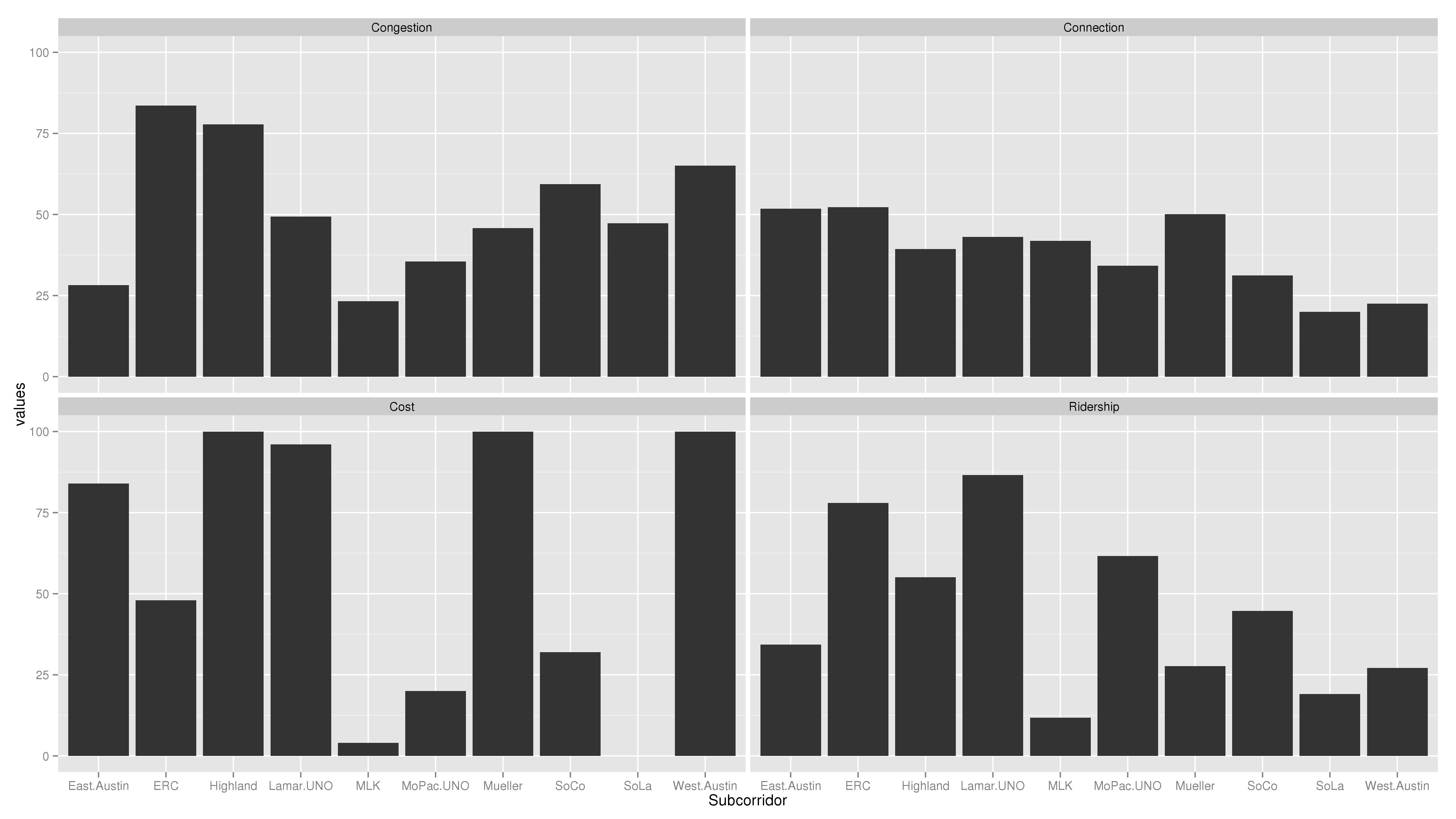
This tells another story: both the Lamar and MoPac subcorridors have seen large increases in ridership. In this view, it’s clear that there are two major routes for high transit ridership: Lamar and Riverside, in that order. Highland has decent ridership, but even building the low-ridership MoPac subcorridor would have higher ridership, just because it would go through the super-high-ridership West Campus neighborhood.
Analysis
Based on these charts, Lamar and Riverside seem frankly head-and-shoulders above the rest of the subcorridors. I could construct “final scores” for each subcorridor, but why bother? The key reason I say that lies in the interpretation of the “Congestion” Question. The question that the Congestion chart answers is not: how much congestion would be relieved in this subcorridor if we built a train here? The question is: how trafficky is this subcorridor? Put another way, congestion is both a blessing and a curse: it shows that there is high transportation demand, but it also shows strong automobile orientation of the infrastructure. Between two subcorridors which promise high ridership–now and in the future–and two subcorridors which promise to be congested–now and in the future–I opt to send the train where the people will ride it.
Caveats
This analysis is only as good as the information that went into it. As Julio pointed out, for the future criteria, there’s reason to doubt that is true. In addition, though I have rejiggered the criteria to more closely answer the types of questions needed to analyze the subcorridors, I haven’t yet dug into the individual indices much to see if the measures they use to answer their sub-questions make sense.
Again, this was coded in R and code will be furnished upon request.
5 thoughts on “Breaking it down and building it back up”
Comments are closed.